18 Bathroom Wallpaper Colors, From Soft Sage to Moody Navy

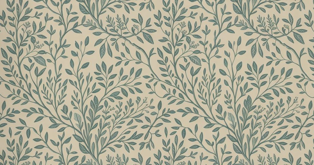
I used to think wallpaper belonged anywhere but a bathroom. Too much steam, too much risk, too fussy for a room that gets splashed daily. Then I started noticing how the bathrooms I screenshot and never forget almost always have a wall doing something gorgeous overhead.
The secret, it turns out, is color. A pattern is nice, but the right hue is what makes a tiny powder room feel deliberate instead of forgotten.
Below you will find 18 bathroom wallpaper colors, each with the motif and palette that makes it sing, plus how to get the look without a single price tag in sight. Ready to pick your shade? Let us walk the rainbow, one wall at a time.
1. Green Bathroom Wallpaper
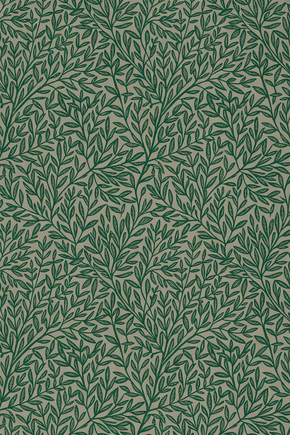
Green is the color I push on everyone nervous about pattern, because it reads as a neutral once it is on the wall. Your eye files it under plant, not bold choice, so it calms a room while still giving you something to look at.
My favorite version is a trailing leaf print, the William Morris Willow Bough school of things: fine emerald fronds on a paler ground, drawn with that hand-blocked, slightly imperfect line. It feels collected, not bought.
To get the look, pair an emerald botanical with warm brass fixtures and a creamy trim, something like Little Greene Slaked Lime on the woodwork so the green stays the star. Start with the paper, then let the paint follow the lightest leaf in it.
2. Blue Bathroom Wallpaper
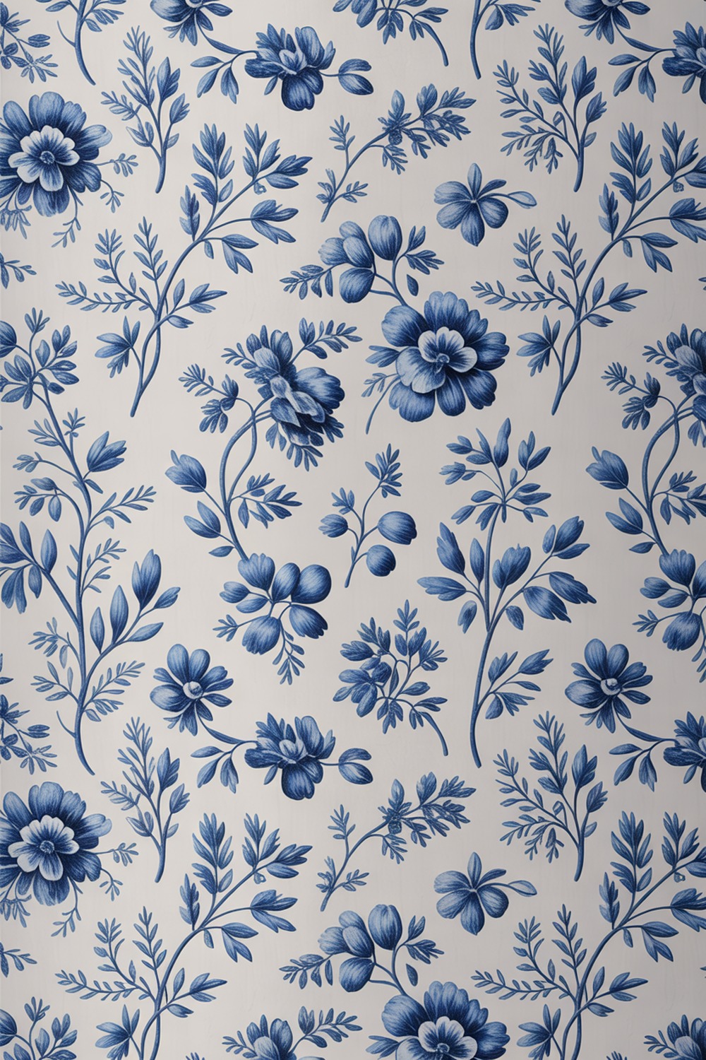
Here is my honest take: most blue bathrooms go too icy. The fix is a blue with warmth or depth, a denim, a Delft, a soft slate, never a flat primary that feels like a hospital corridor.
A classic Delft-inspired print, loose cobalt florals on a soft pale ground, brings centuries of charm to a modern room. Pro tip: in a windowless bathroom, choose the paper with the most white in it, because blue drinks light. Pair with unlacquered brass and a honed marble shelf.
3. Blue and White Bathroom Wallpaper
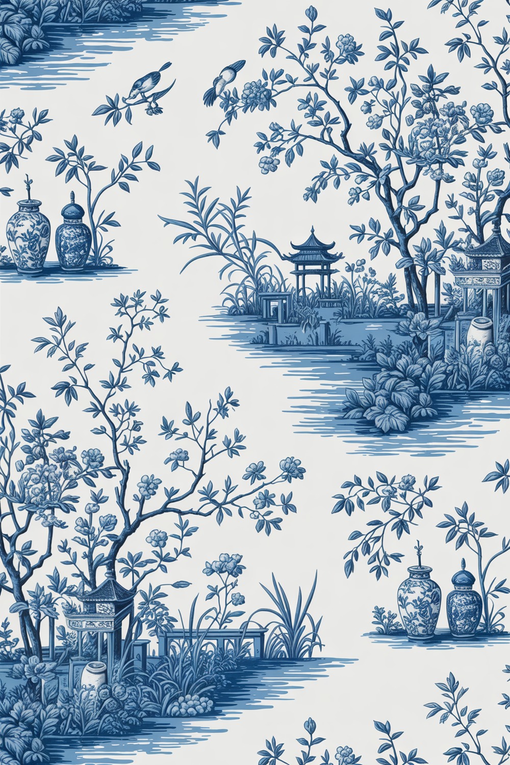
If blue and white had a greatest hit, it would be chinoiserie, that ginger-jar-and-pagoda print in every grandmillennial powder room. I will never get tired of it.
Keep everything else quiet: a white pedestal sink, a chrome tap, a round mirror, and a trim in Benjamin Moore Chantilly Lace. One brave wall, nothing competing.
4. Black and White Bathroom Wallpaper
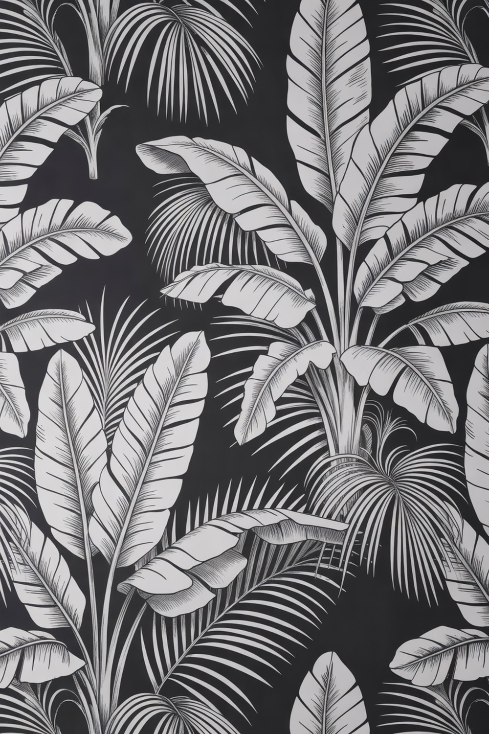
Black and white is where graphic nerve lives, the colorway for people who want drama but swear they hate color. Go big: an oversized monochrome palm, the Martinique banana-leaf idea made famous by that Beverly Hills hotel. On a black ground, the white fronds glow.
In a small room the scale is the whole trick, since a giant print tricks the eye into forgetting the walls are close.
Pair it with a black matte tap, white hex floor tile, and a crisp woodwork white like Benjamin Moore Simply White. Hang it on every wall and let the room commit.
5. Black Bathroom Wallpaper
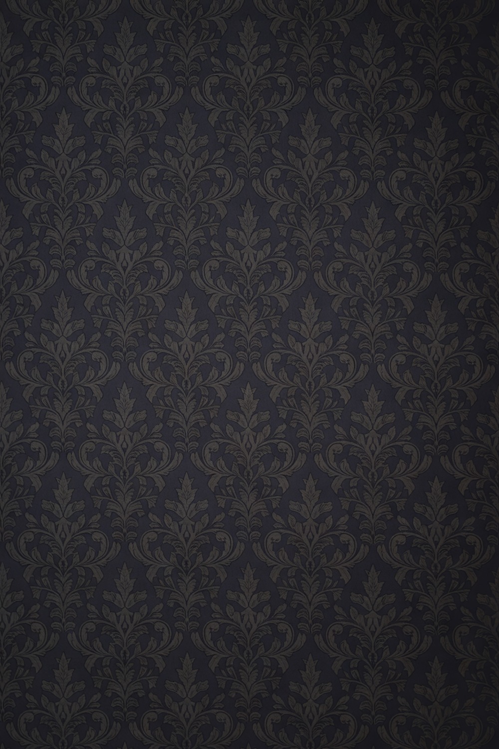
An all-black wallpaper sounds terrifying and turns out dreamy. Think an inky ground with a low-contrast, tone-on-tone pattern, a black damask or a near-invisible charcoal floral, so the wall reads as texture and shadow rather than a solid slab.
This is the jewel-box move. In a small powder room with no natural light, lean in. Darkness there is a feature, not a flaw.
To recreate it, choose a self-patterned black paper with a subtle sheen, add warm gold sconces either side of the mirror, and a single stem of something green.
Finish the trim in Farrow and Ball Pitch Black so the edges disappear and the room feels bottomless. In a windowless loo, this is the one time I say go darker, not lighter.
6. Dark Bathroom Wallpaper
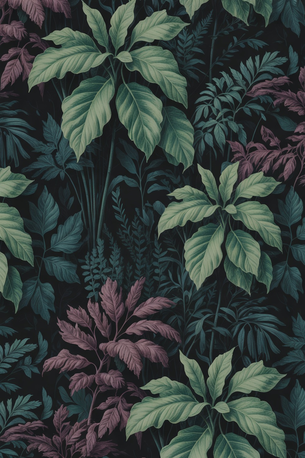
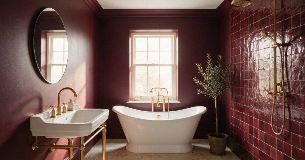
Dark does not have to mean black. Some of my favorite moody walls are deep aubergine, bitter chocolate, or a forest so deep it looks black until the light hits.
A dark ground with a rich botanical, oversized leaves in bottle green and plum, gives depth without the severity of true black. Here is the move that sells it: carry the color up and over the ceiling.
Papering the fifth wall makes a small dark bathroom feel like a cocoon instead of a closet. Antique brass and an aged mirror keep it soulful.
7. Moody Bathroom Wallpaper
Moody is a feeling more than a color, that hush you get walking into a dim, enveloping room. You know the drop in your shoulders when a space feels like a held breath.
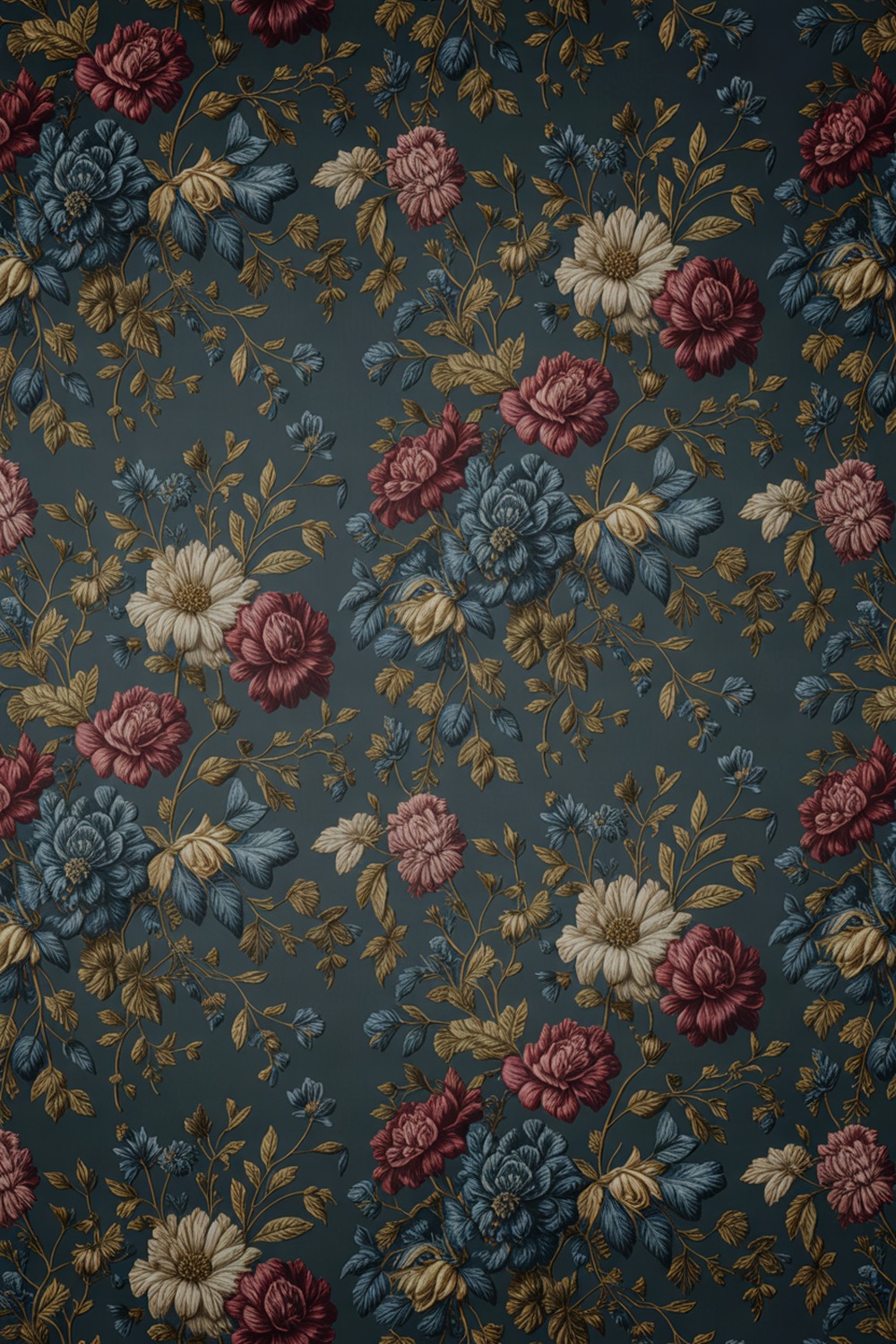
I get there with a dramatic dark floral, oversized blooms in burgundy and ink on a stormy teal ground, the House of Hackney kind of maximalism. It is theatrical and I love it.
Light it low and warm, 2700K bulbs only, and leave out anything bright white. Pair with aged brass, a smoky mirror, and a trim in Little Greene Dock Blue. Let the pattern be loud and everything else whisper.
8. Pink Bathroom Wallpaper
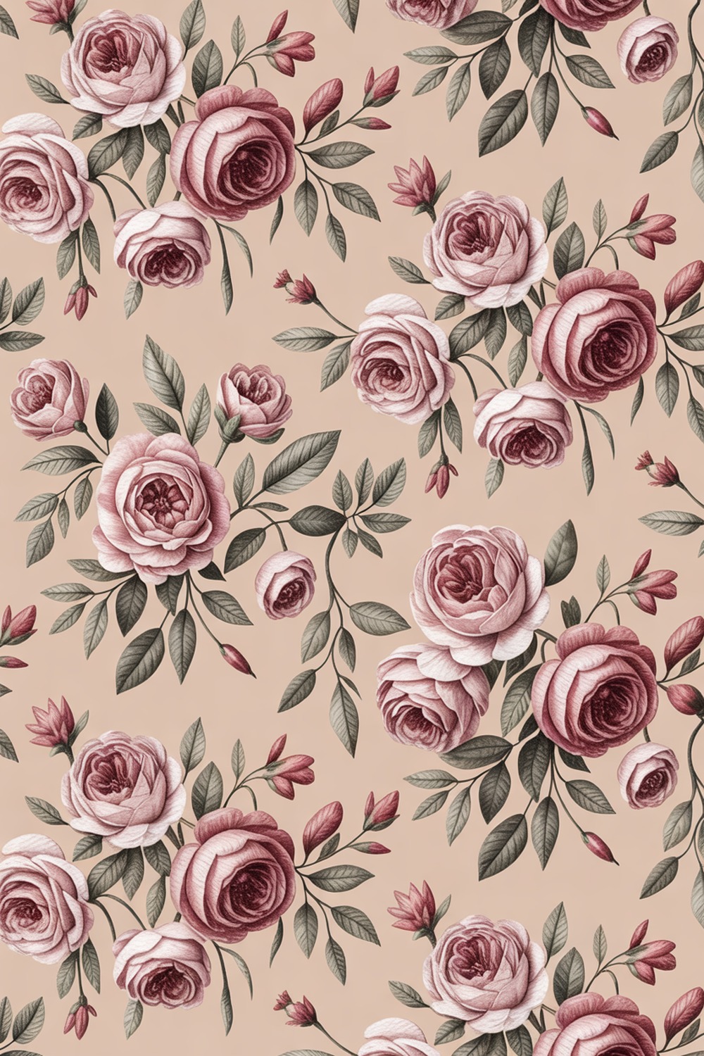
Pink gets dismissed as girly, which is a shame, because a dusty, grown-up pink is one of the most flattering colors you can stand in. Your reflection thanks you.
My pick is a painterly rose floral on a warm blush ground, dusty mauve blooms with sage leaves, think Rifle Paper Co, pretty but not saccharine. The roses read soft and grown-up rather than cutesy.
Anchor it so it stays sophisticated: a warm white sink, brushed brass, and a trim in a deeper rose like Farrow and Ball Sulking Room Pink. Begin with the paper, match the trim to its shadows.
9. Neutral Bathroom Wallpaper
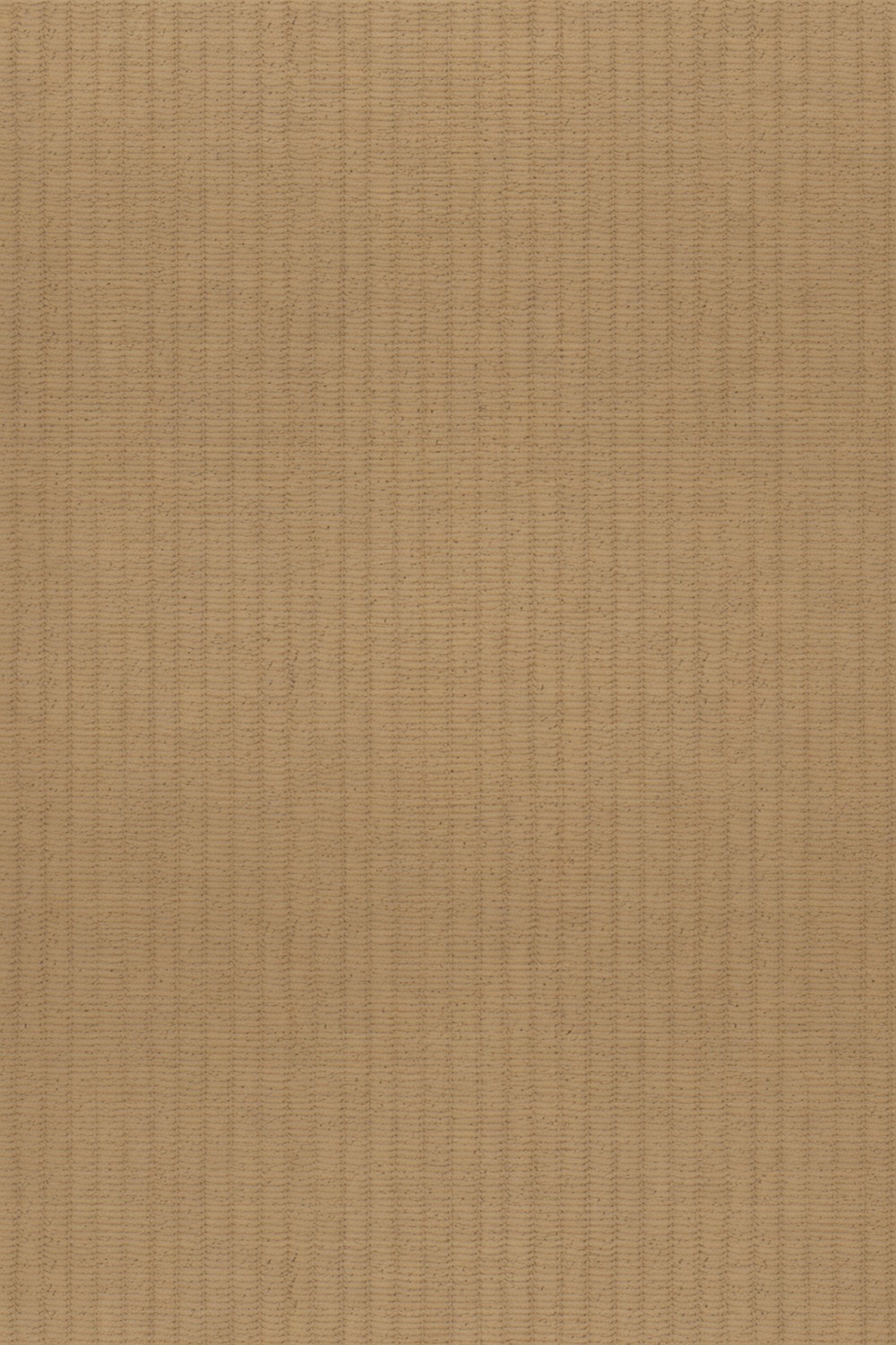
Neutral wallpaper is not a contradiction, it is a flex, and the secret is texture over pattern. A grasscloth, that woven natural fiber with real nubby dimension, turns a plain oatmeal wall into something you want to touch.
True grasscloth and heavy humidity can argue, so in a splashy bathroom choose a faux-grasscloth vinyl with the same oatmeal texture. Pair with oak, linen, and warm nickel.
10. Navy Bathroom Wallpaper

Navy is the dependable one. It flatters brass, it hides fingerprints, and it never looks cheap. What more do you want?
I love a navy ground scattered with a tiny gold motif, a fine star print or a small sprig, so the wall shimmers a little when you catch it. It feels custom and quietly luxe.
To get it, choose a navy paper with a metallic gold accent, add a gold-framed arch mirror and a white basin, then carry the navy down with a Hague Blue (Farrow and Ball) painted wainscot. Start with the paper, paint the dado to match its background.
11. Sage Green Bathroom Wallpaper
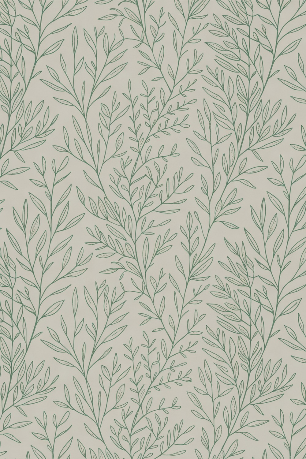
Sage is the Goldilocks of greens, soft enough to relax in, present enough to feel intentional. It is the one I would choose if I only got a single green for the rest of my life.
Picture a delicate sage botanical, slim eucalyptus stems or a muted leaf trellis on a chalky off-white. The whole thing feels fresh-laundered and calm, like a spa that actually earned the word.
Keep the finish matte, never shiny, because sheen cheapens a soft sage fast. Pair with honed marble and warm brass, then trim in Farrow and Ball Card Room Green, picking up the deepest leaf.
Tile first if you are retiling, then let the paper echo it above. Of all 18 colors here, this is the one I would live with longest.
12. Yellow Bathroom Wallpaper
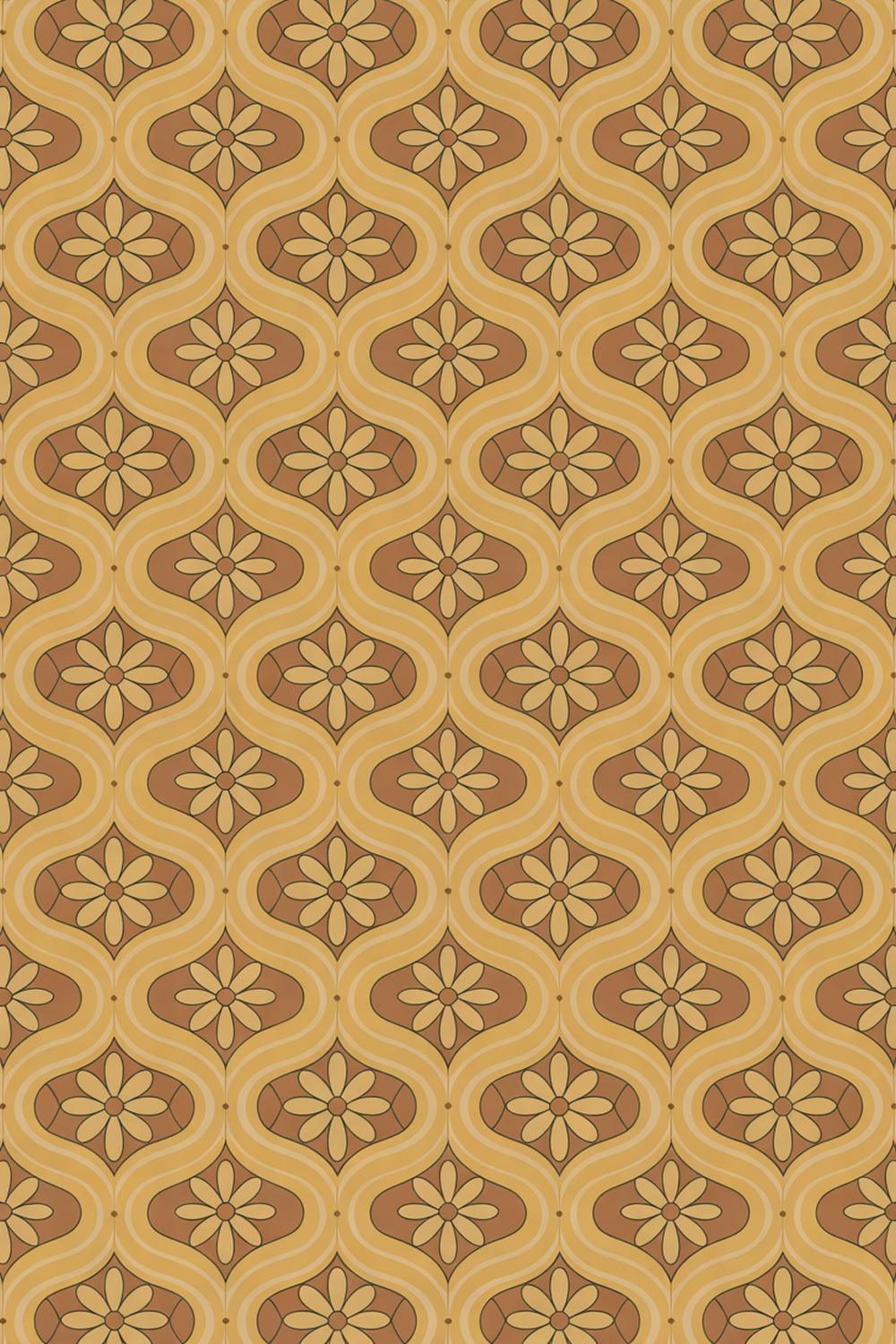
Yellow takes nerve, and it rewards you with the happiest room in the house. There is no being grumpy in a buttercup bathroom. I have tried.
Pass on the acid-bright and reach for a warm, golden yellow, a 1970s-leaning print with soft retro florals. Ground it with white and natural wood, a trim in Sherwin-Williams Pure White, an oak stool. One brave color, done.
13. Terracotta Bathroom Wallpaper
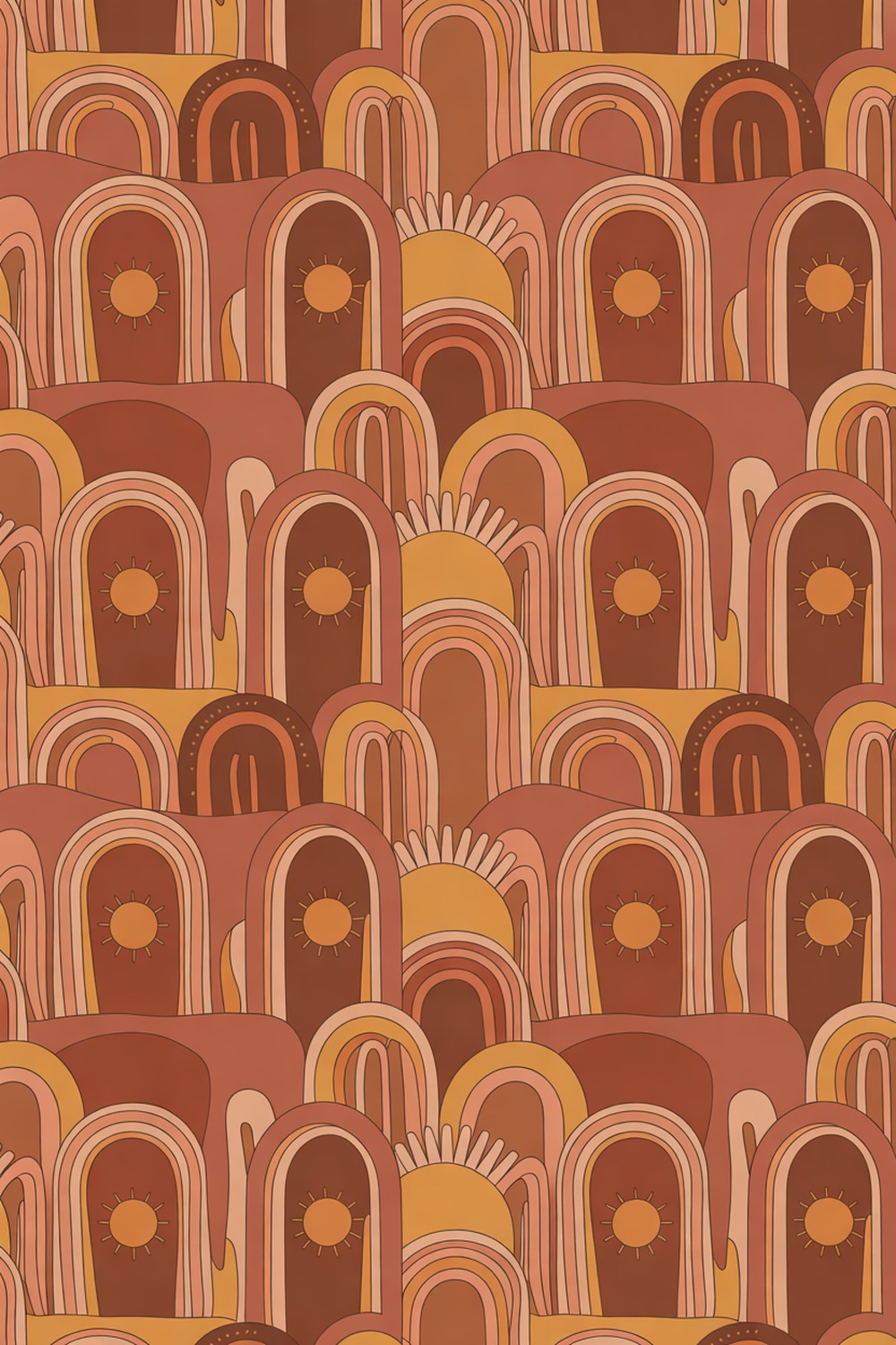
Terracotta is having a long, well-deserved moment, and in a bathroom it reads warm and sun-baked, like a courtyard in Marrakech. It is the earthy antidote to all those cold grey rooms.
I reach for a terracotta ground with an arched or desert-toned pattern, clay, rust, and soft apricot layered together. The palette alone makes a room feel ten degrees warmer.
Lean into the earthiness: zellige-style tile below, a round rattan mirror, a matte black tap, and unglazed pottery. For trim, Backdrop Mangata or any soft putty keeps the clay tones grounded. Start with the paper, pull the tile from its lightest clay.
14. Gold Bathroom Wallpaper
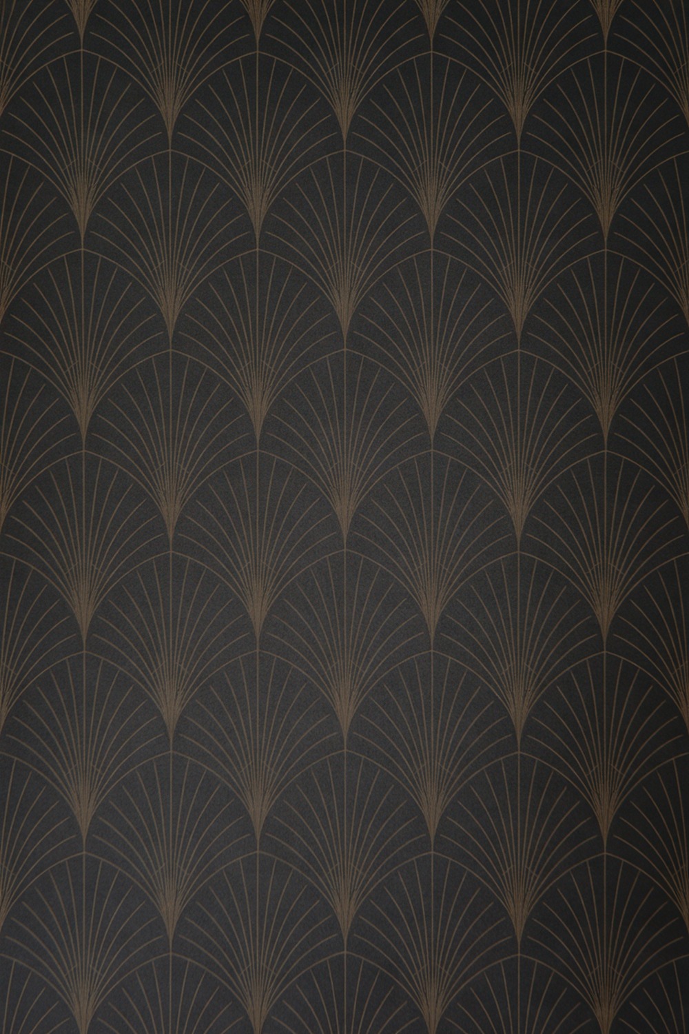
Gold wallpaper is pure glamour, and used right it feels less Vegas and more old Hollywood.
The restrained way to do it is a metallic gold motif on a dark ground, an Art Deco fan or a fine geometric that catches the light as you move. The shimmer does the work, so the pattern can stay simple.
Keep hardware in the same warm family, polished brass or true gold, and leave chrome out of this one. Add a fluted vanity, a round backlit mirror, and a near-black trim like Dulux Night Jewels. The gold should feel like jewelry on the room, one statement, worn well.
15. Blush Bathroom Wallpaper
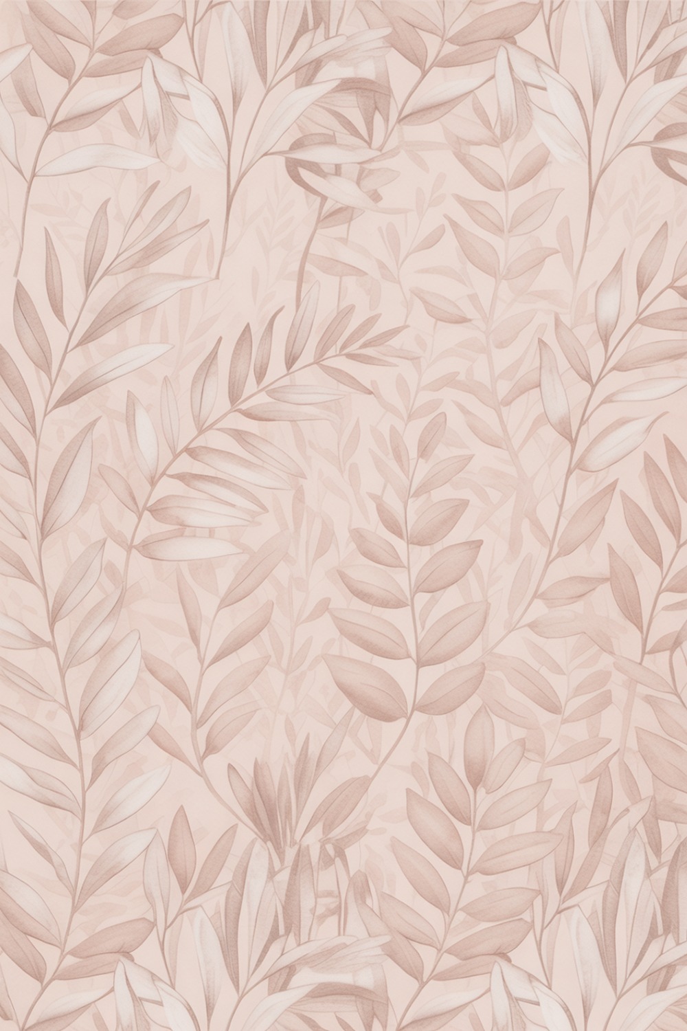
Blush is pink’s quieter, more sophisticated sister, the barely-there flush that makes a room feel soft without announcing a color at all.
Go for a blush ground with a tonal watercolor wash or the faintest botanical, almost a whisper of pattern. To keep it grown-up, pair warm whites, pale oak, and brushed brass, with a trim in Benjamin Moore First Light so the blush melts into the woodwork.
16. Teal Bathroom Wallpaper
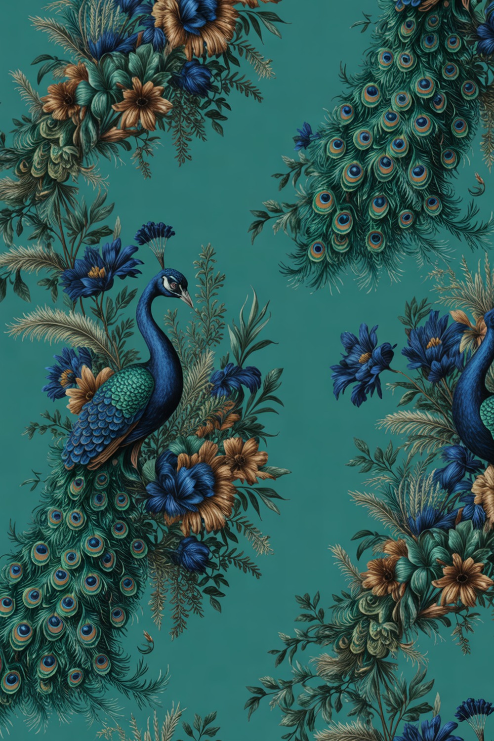
Teal is the color for people who find navy too safe and emerald too expected. It sits right between blue and green and somehow flatters everything.
My favorite is a peacock-rich teal with a jewel-toned pattern, feathered plumes or a lush dark floral in inky blues and greens. Push it toward luxe with aged brass, a smoky veined marble, and warm low lighting.
Trim it in Farrow and Ball Vardo to deepen the teal, and hang it in a windowless powder room, where the richness has nowhere to go but gorgeous.
17. Grey Bathroom Wallpaper
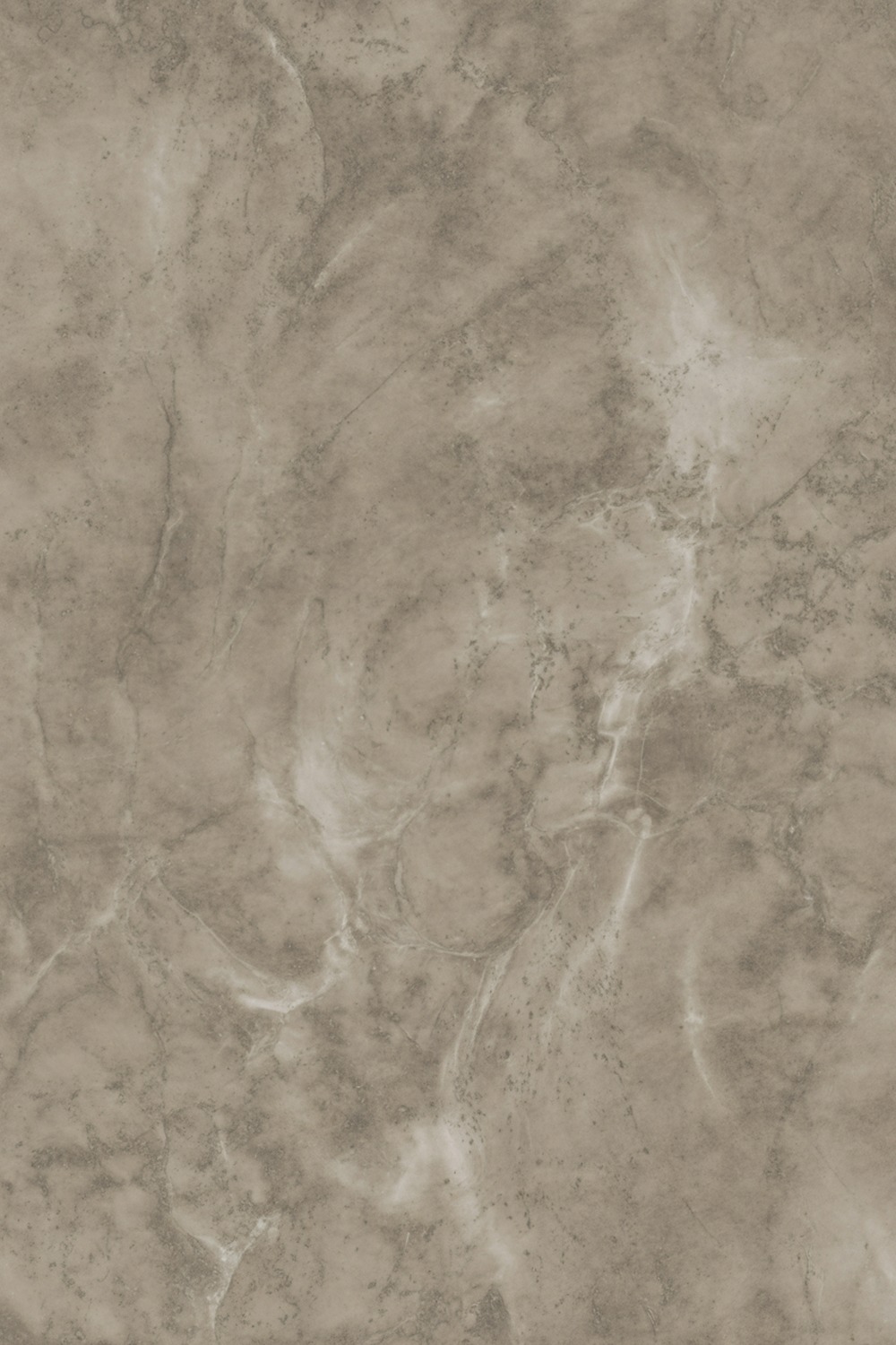
Grey got a bad rap as the beige of the 2010s, but a warm grey with real texture is timeless, not dreary. The difference is all in the undertone.
I love a greige ground with a subtle marbled or concrete-effect pattern, soft veining that reads architectural. It gives you the look of stone walls without the weight.
Keep the undertone warm, never blue-grey, which is where grey goes cold and sad. Pair with white sanitaryware, matte black fixtures, and a trim in Dulux Chic Shadow. Start with the paper, then echo its palest vein in the floor tile.
18. Cream Bathroom Wallpaper
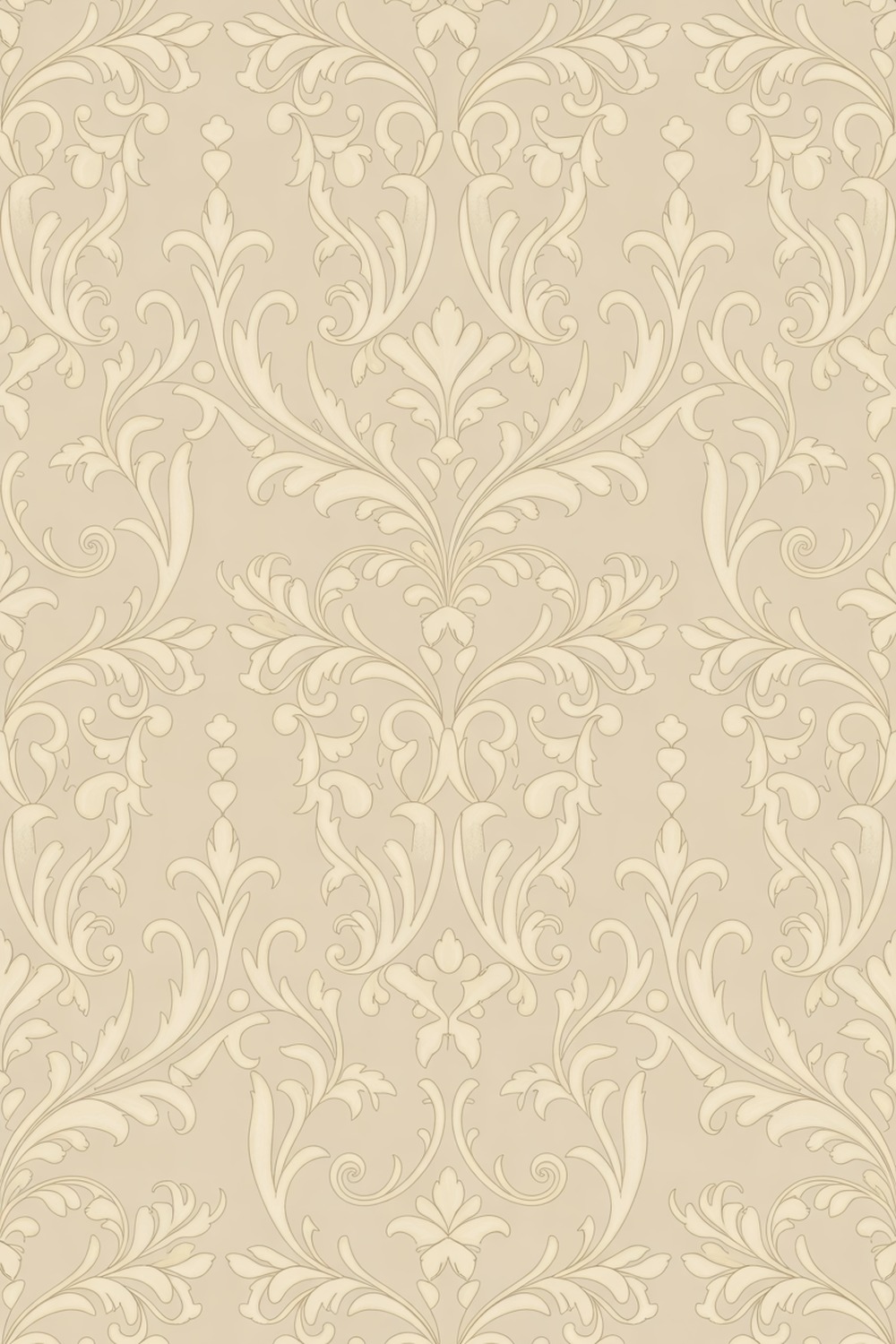
Cream is the warm white that white always wishes it were. It softens a room instead of sharpening it, and it never looks as stark under bathroom lighting.
My go-to is a cream ground with a tonal damask or a self-colored scroll, pattern you feel more than see. Cream on cream is the quiet-luxury move, all texture and shadow.
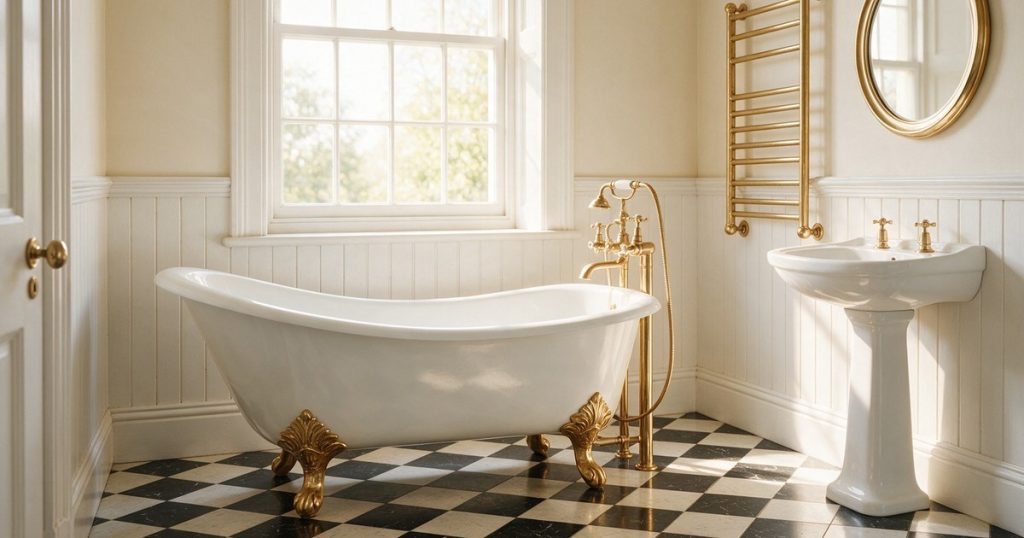
To recreate it, choose a low-sheen cream paper, add warm brass, aged oak, and a trim just a shade deeper in Farrow and Ball School House White.
Keep every finish warm and matte. After a whole list of brave color, cream is the softest landing there is, proof that the quietest wall can still be the one you notice.
Which Bathroom Wallpaper Color Is Right for You
Start with how the room makes you feel, then pick the color to match. Want calm? Sage, blush, cream, or a soft neutral grasscloth will hush a busy morning.
Craving drama? Black, moody florals, deep teal, and gold reward a windowless powder room, the one space where you can go fearless because there is no view to compete with.
Chasing cheer? Yellow, terracotta, and a sunny blue and white lift a dark north-facing bathroom. And if you only trust yourself with one brave move, green is the safest bold color there is, because your eye forgives it as nature.
My rule of thumb: the smaller and darker the room, the braver you can be. A tiny powder room is the best place to try the color you would never dare put in a whole suite.
Bathroom Wallpaper, Answered
Can you really put wallpaper in a bathroom?
Yes, and modern vinyl papers are made for it. In a splashy family bath, choose a paper rated for humidity, keep it off the direct shower splash zone, and run an extractor fan. A powder room with no shower is the most forgiving place to start.
Is it a DIY job or one for a pro?
A small powder room in peel-and-stick is a genuine weekend DIY. The moment you have a big pattern to match, a tricky ceiling, or traditional paste-the-wall paper, a pro hanger pays for themselves in saved misalignment.
How long does it take?
A single accent wall is an afternoon. A whole small bathroom, prepped and papered properly, is a day, maybe a weekend if you are matching a big repeat and letting the walls dry between steps.
What should I spend on versus save?
Put your money into the paper itself, since a good design in a durable finish is the whole point, and go easy on the surrounding fixtures. One brave roll does more than a room full of upgrades.
What do I ask for at the shop?
Ask for a bathroom-suitable or scrubbable vinyl, give them your wall measurements for the repeat, and ask how much extra to buy for pattern matching. A big repeat needs more paper than the raw square footage suggests.
Whatever color pulls at you, start small and start today. Pick one wall, one shade that makes you happy, and let your bathroom be the room that finally gets to show off.
More stories
Share this story