21 Single-Color Bathroom Tile Ideas for a Cohesive, Custom Look

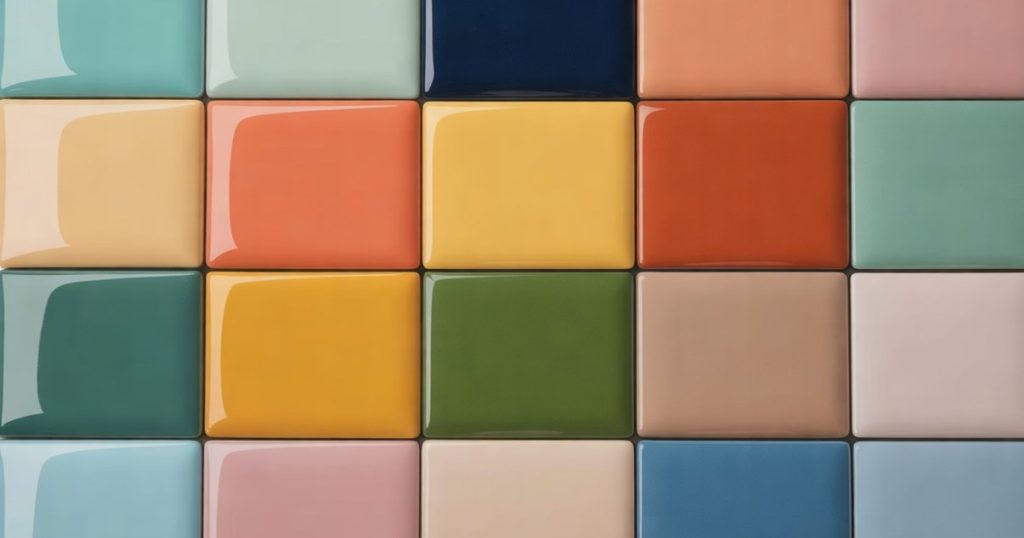
Most bathroom tile advice tells you to play it safe. Pick a greige, add a white subway, call it a spa. I find that a little boring, honestly. The rooms that stop me mid-scroll are the ones that pick a single color and lean all the way in.
That is the whole idea here: one brave color, wall to wall, with nothing fighting it. Committing to a single shade reads as custom, not accidental, and it hides the seams that busy two-tone schemes put on display.
Below are 21 single-color bathroom tile looks, one shade per room, from soft powder blue to deep forest green. Each comes with the tile shape I would use, a paint to pair it with, and the one move that makes the color feel intentional instead of loud.
1. Aqua Bathroom Tile
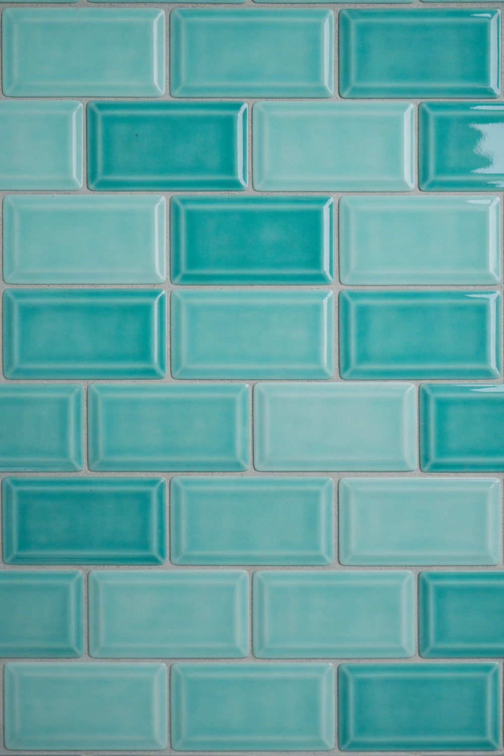
Aqua is the color that talks you out of beige. It sits between blue and green, so it feels like water without shouting “beach house.” I would run it in a glossy 3×6 subway, laid in a classic offset brick bond, so the sheen does the work.
Keep the grout a pale sand, never bright white, or the whole wall reads like a swimming pool. A warm brass tap is the one finish worth the splurge against all that cool gloss. Start with the tile, and let the vanity follow its lead.
If you only change one thing in a tired bathroom, make it this. Aqua on every wall turns a builder-grade box into something that feels chosen.
2. Mint Green Bathroom Tile
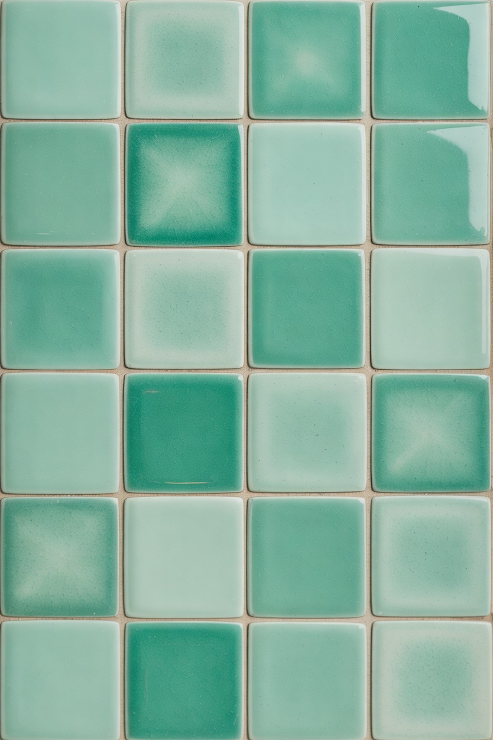
There is a reason mint keeps coming back. It is fresh without being cold, and it flatters skin under morning light better than any grey ever will. My pick is a handmade 4×4 zellige, the Moroccan clay tile whose glaze pools and shifts, so no two squares match.
Pair it with a soft white trim, think Benjamin Moore White Dove, and matte black hardware to ground all that candy. The variation in the glaze is the point, so let it be a little imperfect.
3. Light Blue Bathroom Tile
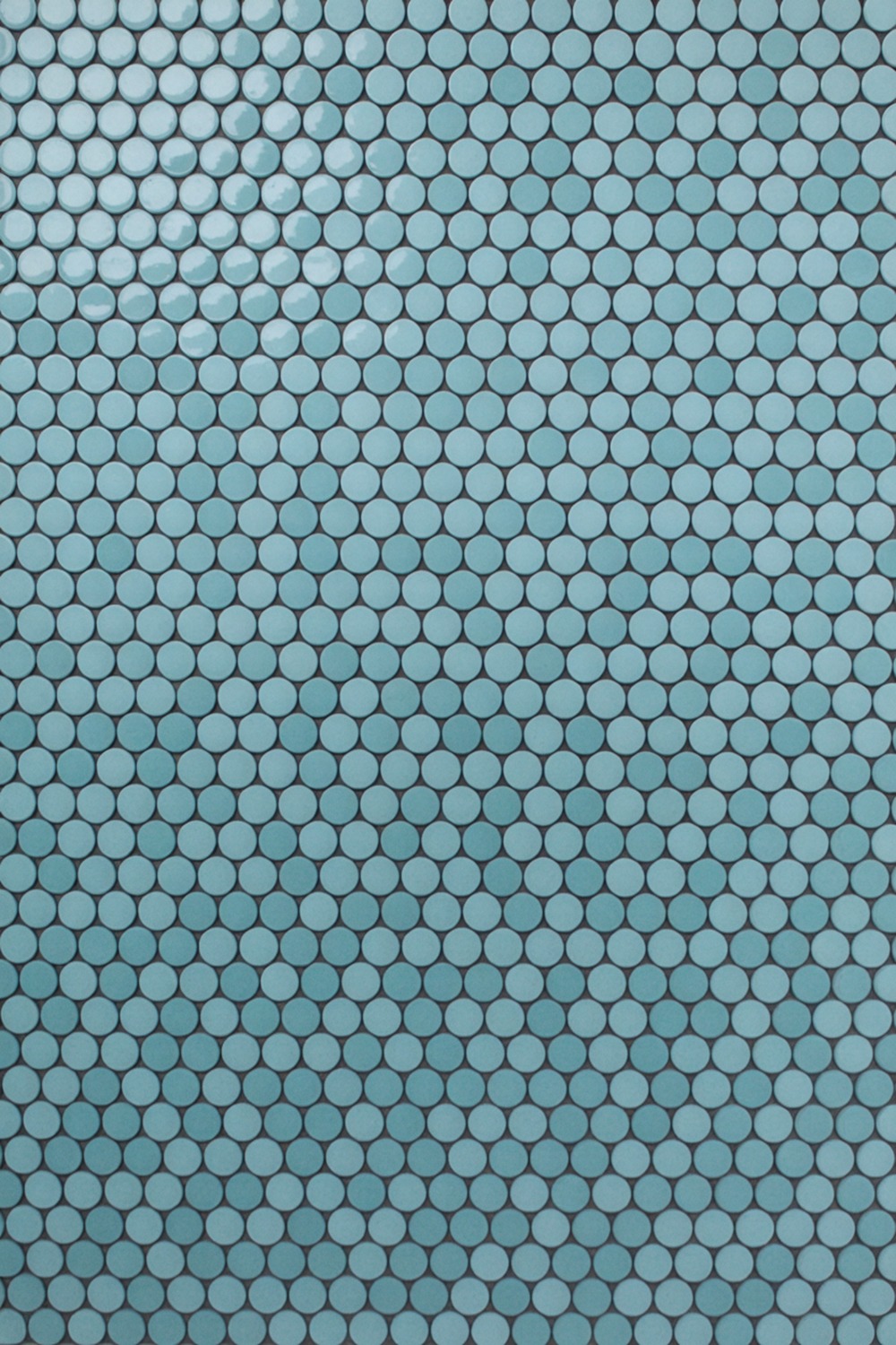
Light blue is the easiest color to get wrong and the easiest to get right. My fix is a penny-round mosaic in a greyed sky blue, run across the floor like a vintage hotel. Pair it with Farrow & Ball Borrowed Light and a sharp charcoal grout.
4. Light Green Bathroom Tile
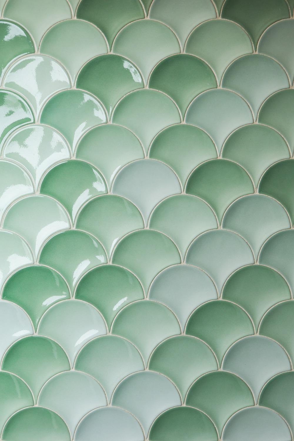
If you want the calm of a garden without a single plant, this is it. Light green, specifically a sage-leaning one, is the greige of the next decade, and I will stand by that.
A fish-scale tile, those overlapping scallops, turns the color into something you want to touch. Set it behind the vanity as a feature panel and paint the rest in Dulux Tranquil Dawn. The scallop shape adds movement, so the room never feels flat even in one color.
5. Navy Bathroom Tile
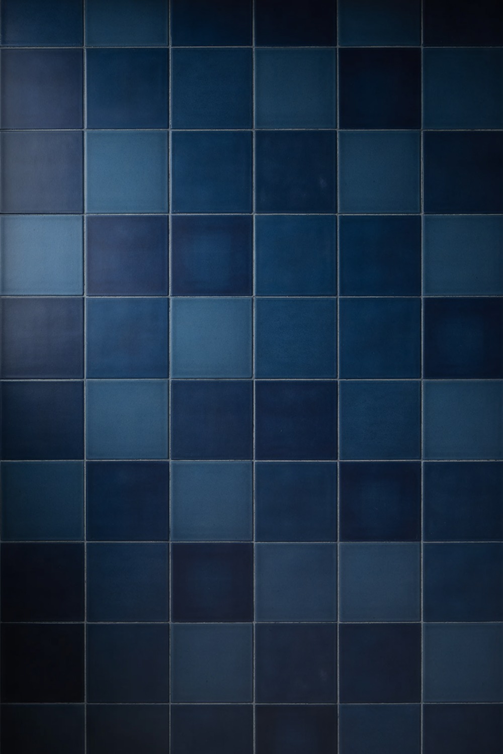
Navy earns its keep in a small bathroom, which surprises people. A dark shade on every wall erases the corners, so the room reads like a jewel box, not a shoebox. I would use a square matte tile in a tight, even grid to keep things calm.
The one rule: give it a warm light, a 2700K bulb, so the navy glows instead of turning to slate. Unlacquered brass fittings and a pale stone counter do the rest.
One warning worth heeding: navy drinks light, so layer in a mirror and a couple of warm sconces before you commit. Do that, and a windowless bathroom turns cocooning instead of dim.
6. Peach Bathroom Tile
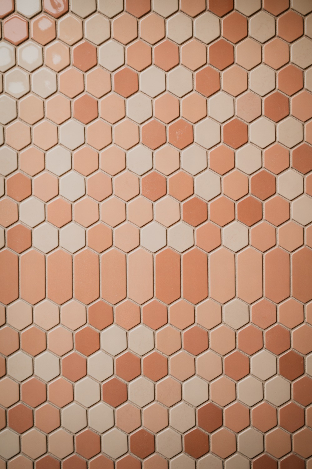
Peach gets written off as a nursery color, which is a pity, because the grown-up version is lovely. A matte hexagon tile pulls warm, pink-tinged terracotta clean out of the 1980s. Keep the grout cream and the accents oak, and it turns into the Nancy Meyers kitchen of bathrooms.
7. Purple Bathroom Tile
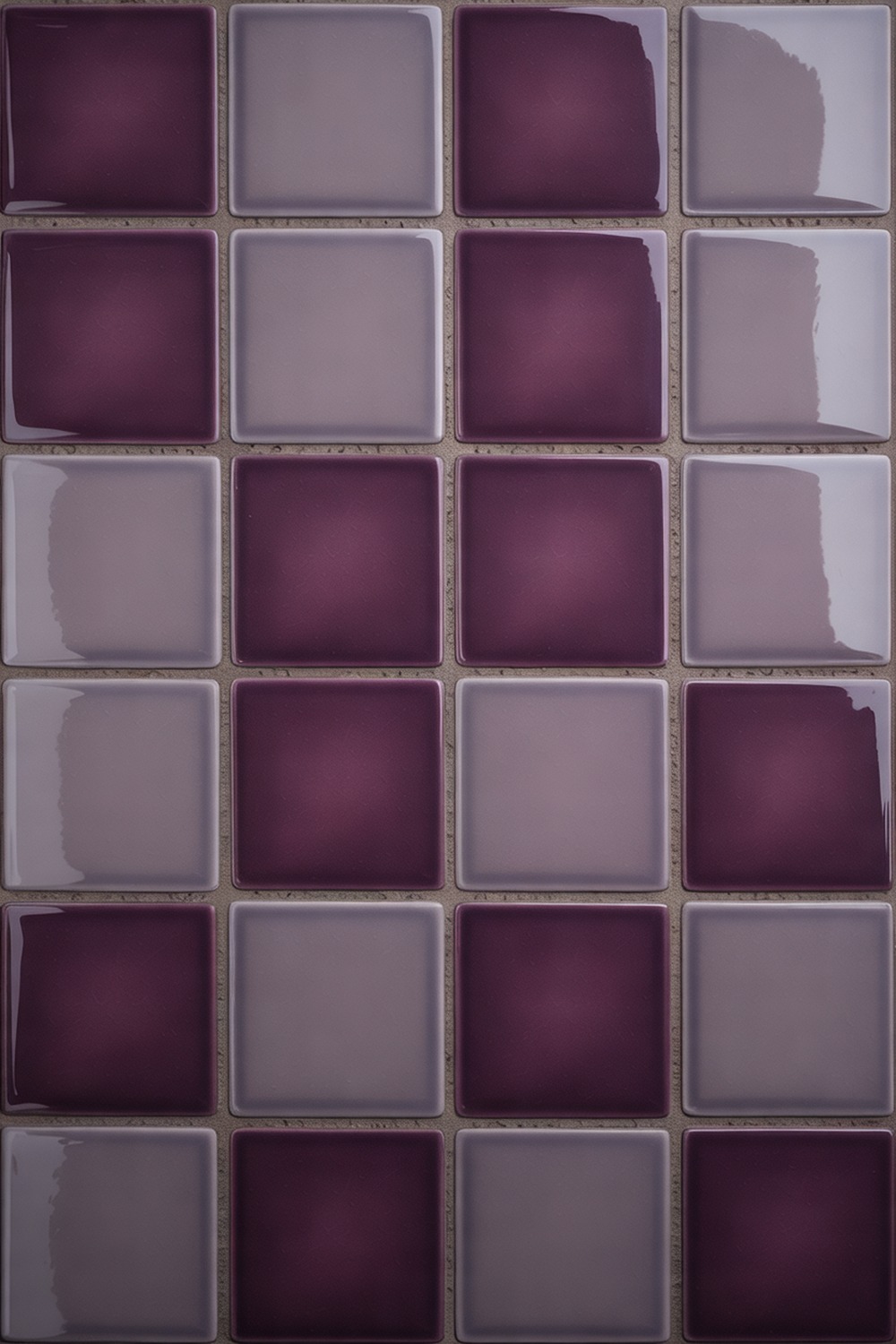
Purple scares people off, and I understand why, but the trick is choosing the right purple. A dusty, greyed aubergine in a glossy 4×4 grid feels expensive, not like a teenager’s room. The gloss catches light and keeps the depth from going murky.
Pair it with soft brass and a warm white, and the purple reads almost neutral. The move that sells it: carry the tile to the ceiling, because a half-wall of purple always looks unfinished.
8. Orange Bathroom Tile
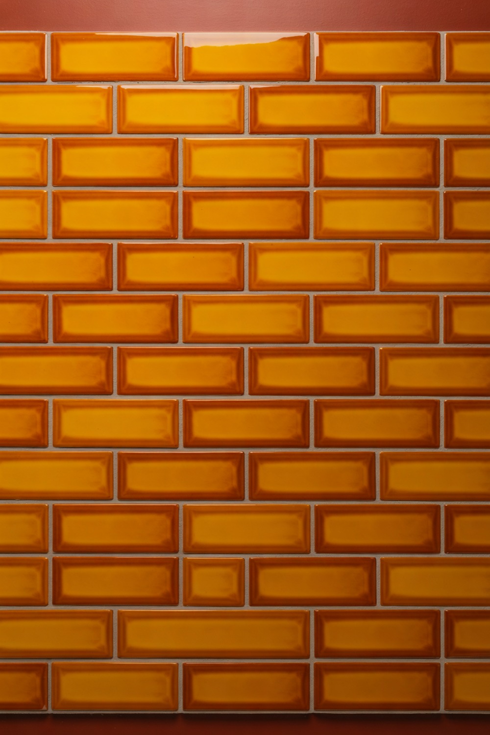
Nobody picks orange by accident, and that is exactly why it works. A burnt, earthy orange near terracotta brings a sun-baked warmth that cool bathrooms always lack. I love it in a glossy 2×8 brick-lay, run horizontally to stretch a narrow wall.
Ground it with a tan stone floor and cream grout so it feels Mediterranean, not fast-food. Add a single olive tree in a clay pot, and you are basically on holiday.
9. Tan Bathroom Tile
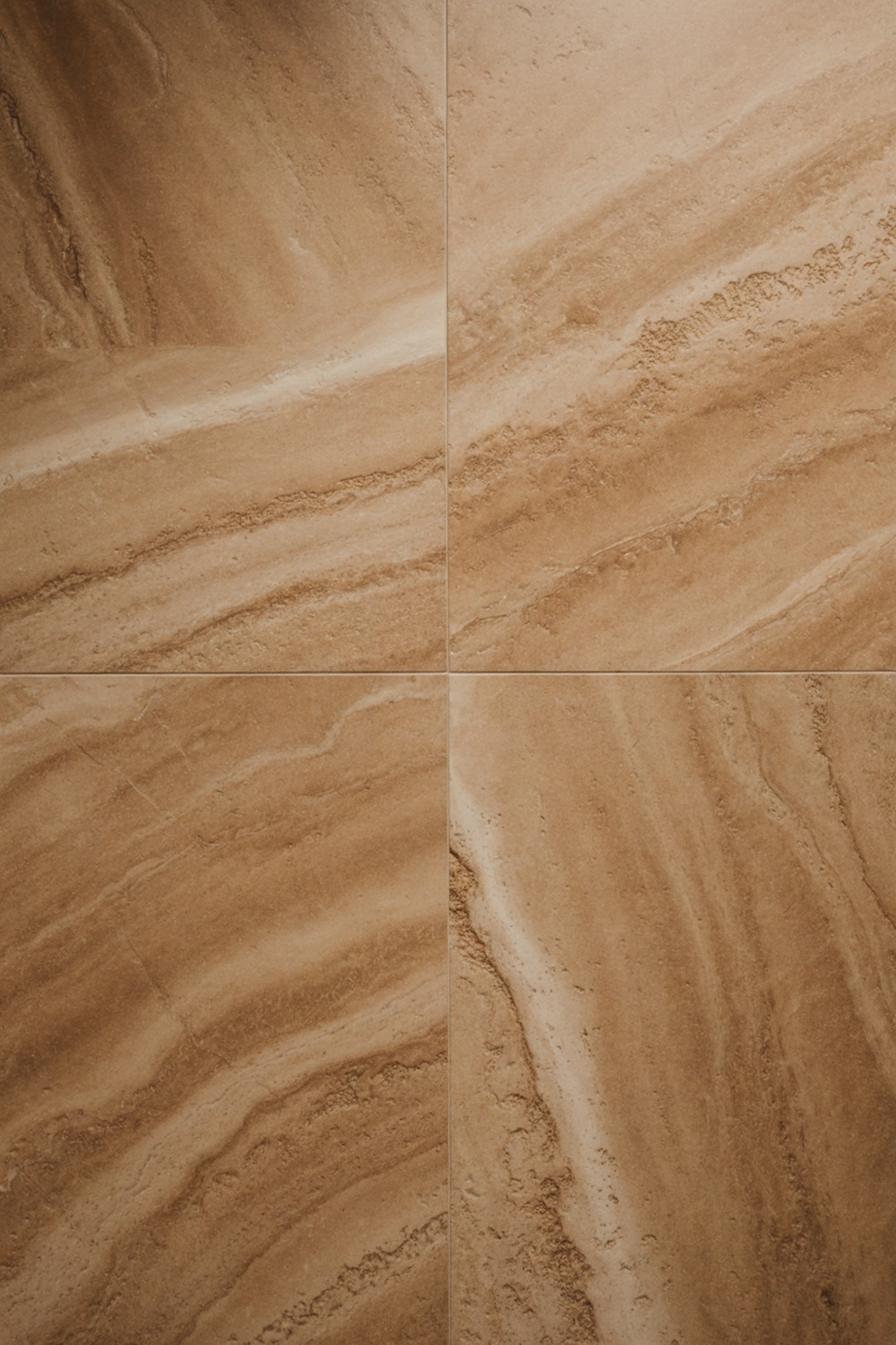
Tan does the quiet, expensive thing that white only pretends to. A travertine-look large-format tile, honed to a soft matte, gives a spa feel on a real budget. Keep it tonal, tan tile and tan grout and linen towels, and let one brass hook be the only shine.
10. Olive Green Bathroom Tile
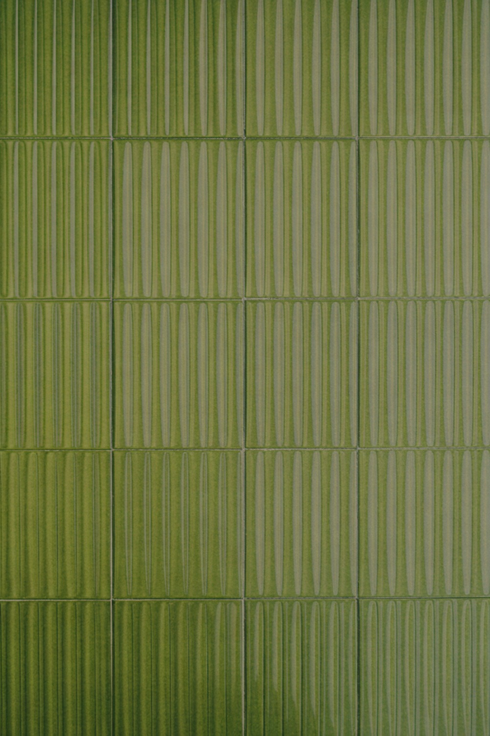
Olive is green that grew up and got a mortgage. It is moody and warm at once, and it flatters brass and oak like few colors can.
My favorite way to use it is a fluted, ribbed tile that runs floor to ceiling, so the vertical lines throw soft shadows all day. A paint like Little Greene Olive Colour above a half-height tile keeps the scheme seamless.
Olive loves lamplight, so dim it in the evening and watch it deepen toward the forest. This is the rare green that feels as good at night as it does at breakfast.
11. Mustard Bathroom Tile
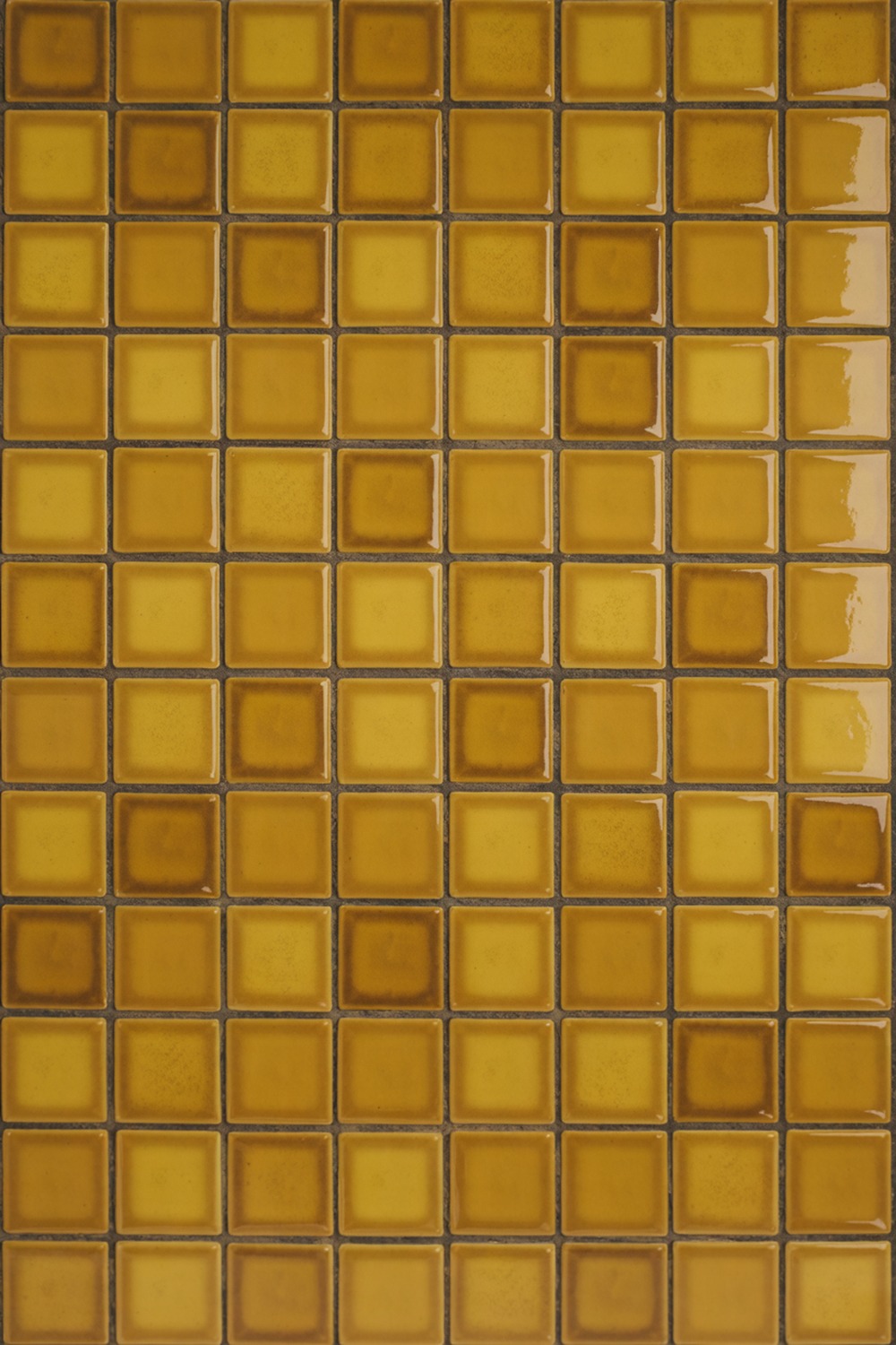
Mustard is a dare. In the right room it is the warmest, most cheerful color you can put on a wall, and a 2×2 square glossy mosaic turns it into a field of tiny golden light.
This is a powder-room color, where you want a guest to gasp. Temper it with charcoal grout and black fittings so it reads mid-century, not cafeteria. Backdrop’s Dijon is the shade I keep coming back to for the paint above it.
12. Coral Bathroom Tile
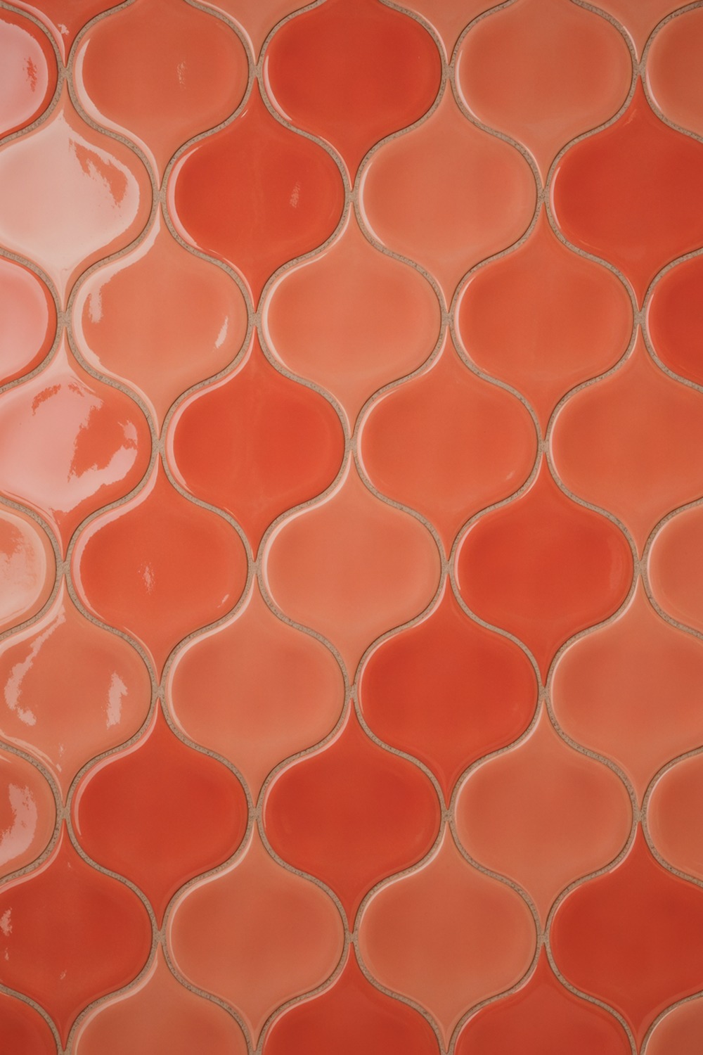
Coral is pink with a pulse, enough orange to feel energetic rather than sweet. An arabesque, lantern-shaped tile gives it a soft Moorish curve. Gloss keeps it vivid, since a matte coral tends to go dusty. I would tile the whole shower in it, then calm the rest with rattan.
13. Ivory Bathroom Tile
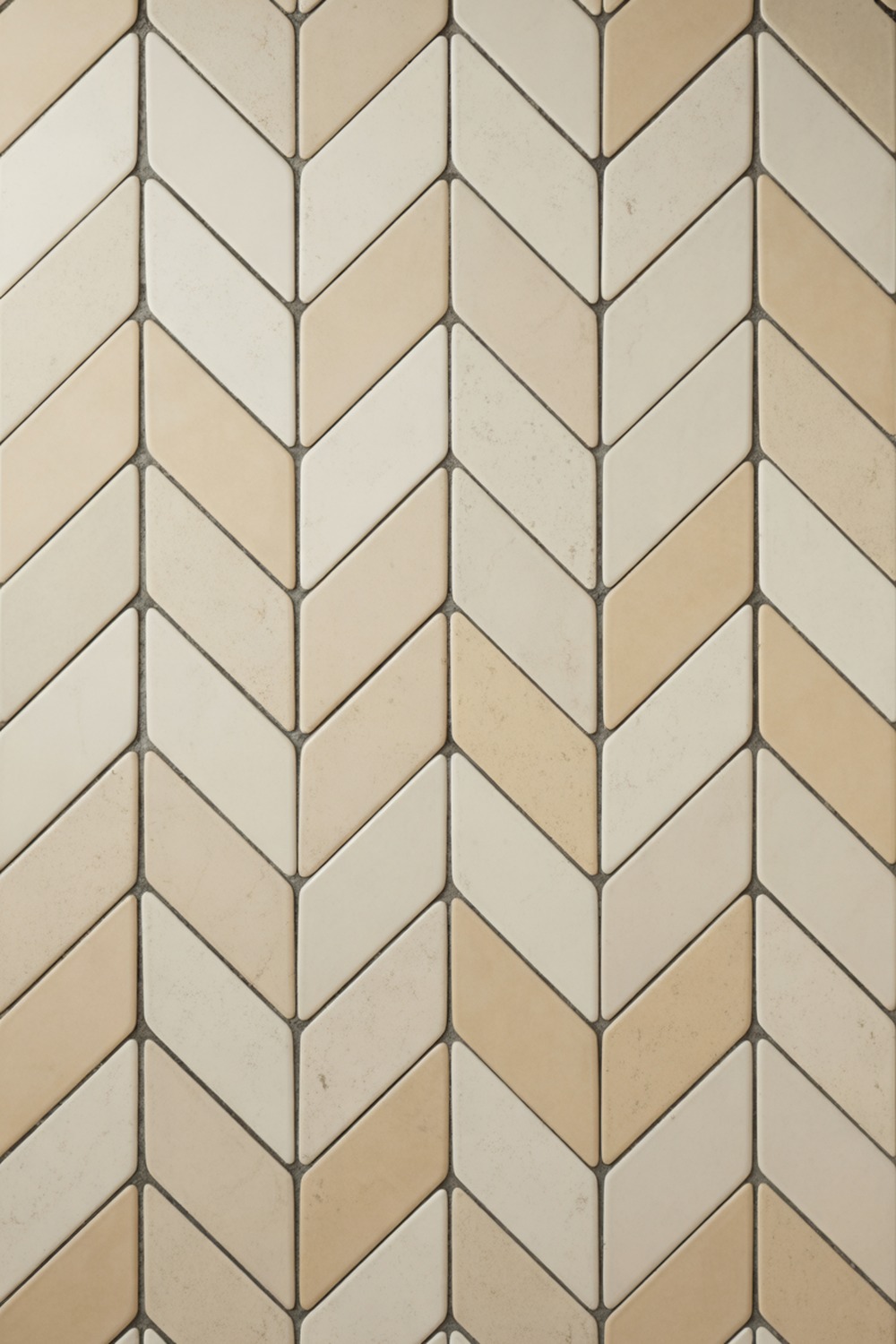
Ivory is what you choose when you want white to feel like cashmere. It holds a drop of yellow that warms a north-facing room no cool white can save. I like it in a matte herringbone, 3×12 planks laid in that classic zigzag, so the texture carries the whole scheme.
The herringbone is doing a lot of quiet work here, which means your fittings can stay simple. Sherwin-Williams Alabaster on the trim closes the loop.
14. Charcoal Bathroom Tile
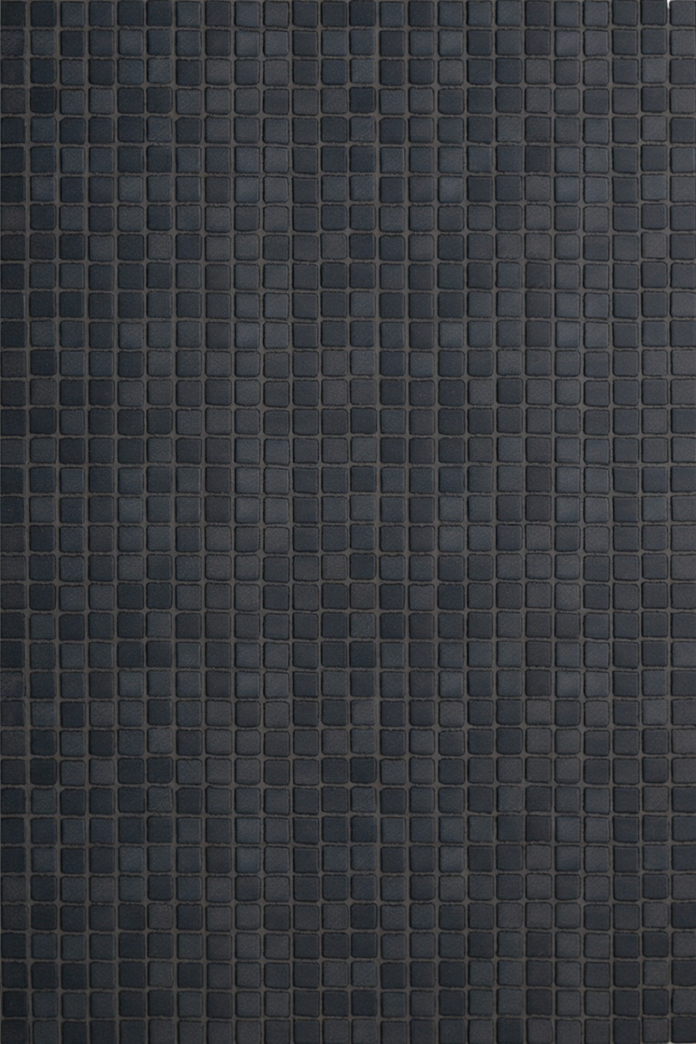
Charcoal brings the drama of black without the hard edge. It swallows light in the best way, and in a windowless bathroom it reads intentional rather than cave-like. A 1×1 matte micro-mosaic gives all that depth a soft, grippy texture underfoot.
Pair it with warm oak and a backlit mirror, and the room turns into the hotel bathroom you never want to leave. Grout in a matching charcoal, always, or the grid will fight the calm.
The trick with a dark floor is texture, so a honed or grippy finish beats a high gloss that shows every footprint. Get that right and charcoal feels like a boutique hotel, not a basement.
15. Silver Bathroom Tile
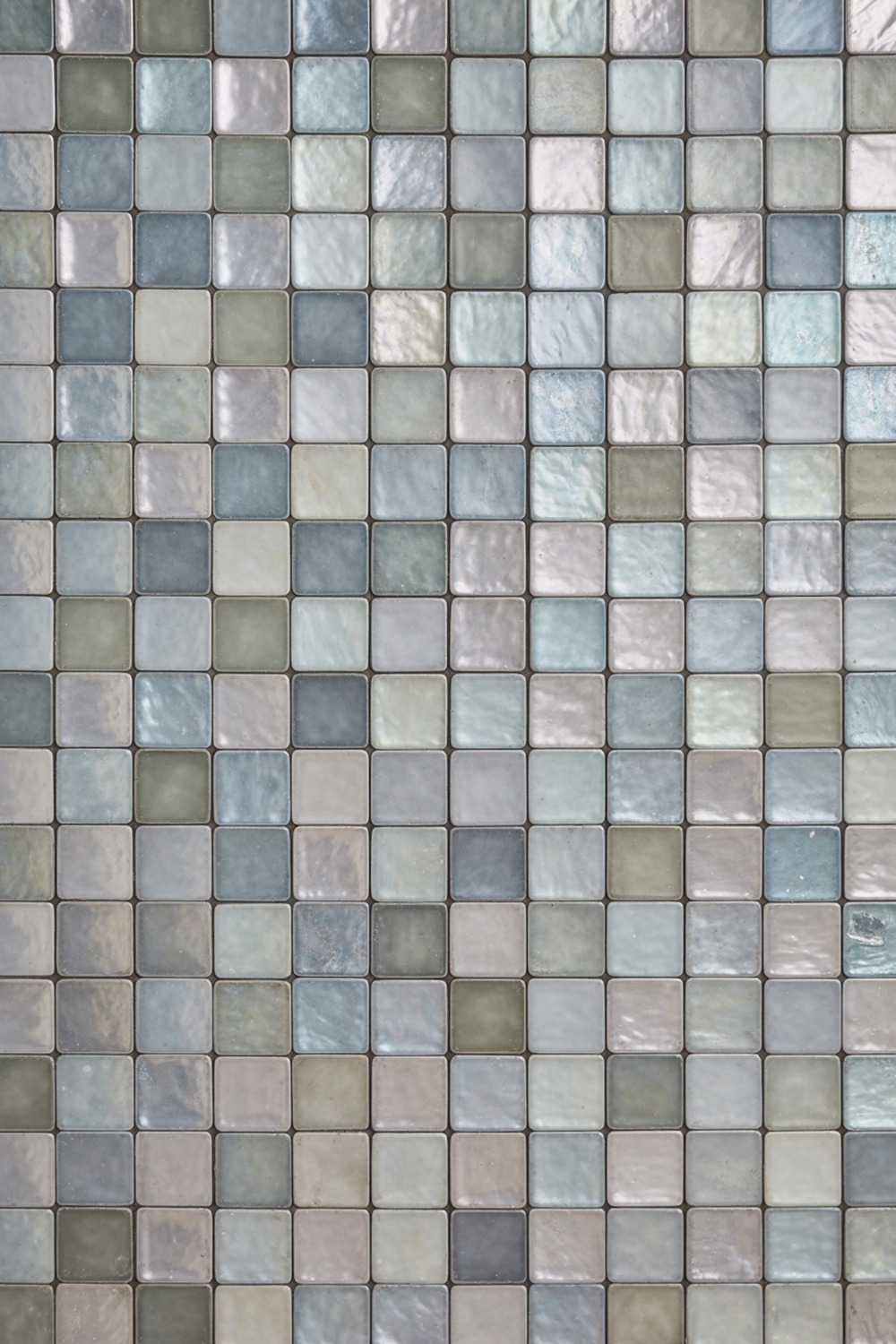
Silver is the color most people forget tile even comes in. A pearlescent glass tile shifts between grey and platinum as you move, giving a plain wall real motion. Over a whole wall it feels like a 1930s cinema. Keep everything else matte and let the tile be the jewelry.
16. Rose Pink Bathroom Tile
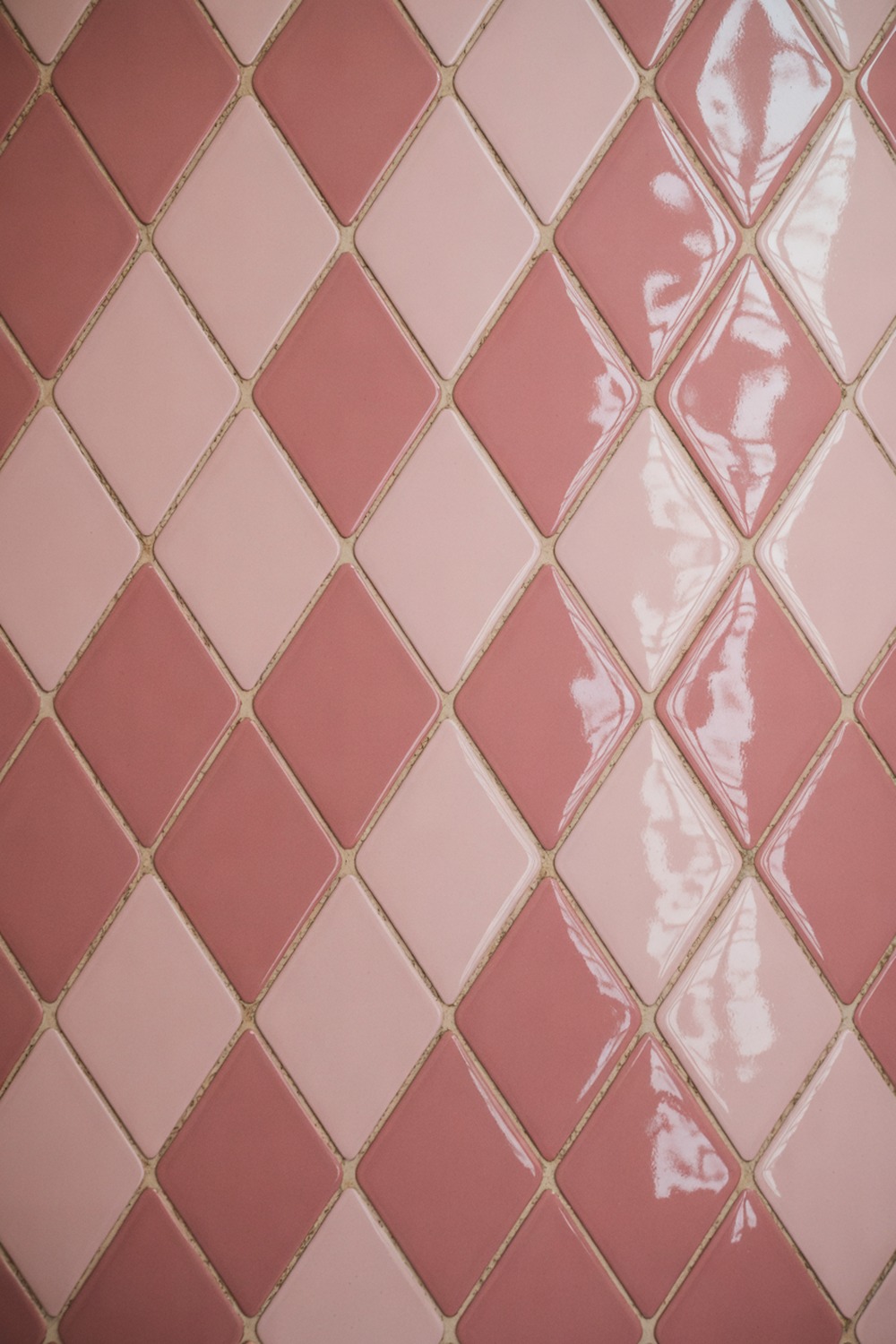
Rose pink is the pink that convinces skeptics. It is soft, a little dusty, and reads as a warm neutral once it is on every wall. I would set it in a glossy diamond, a harlequin pattern, so the color gets a bit of vintage architecture to sit in.
A warm white ceiling and aged brass keep it from tipping twee. Think a soft plaster pink, close to Farrow & Ball Setting Plaster, and let that anchor the paint.
17. Lavender Bathroom Tile
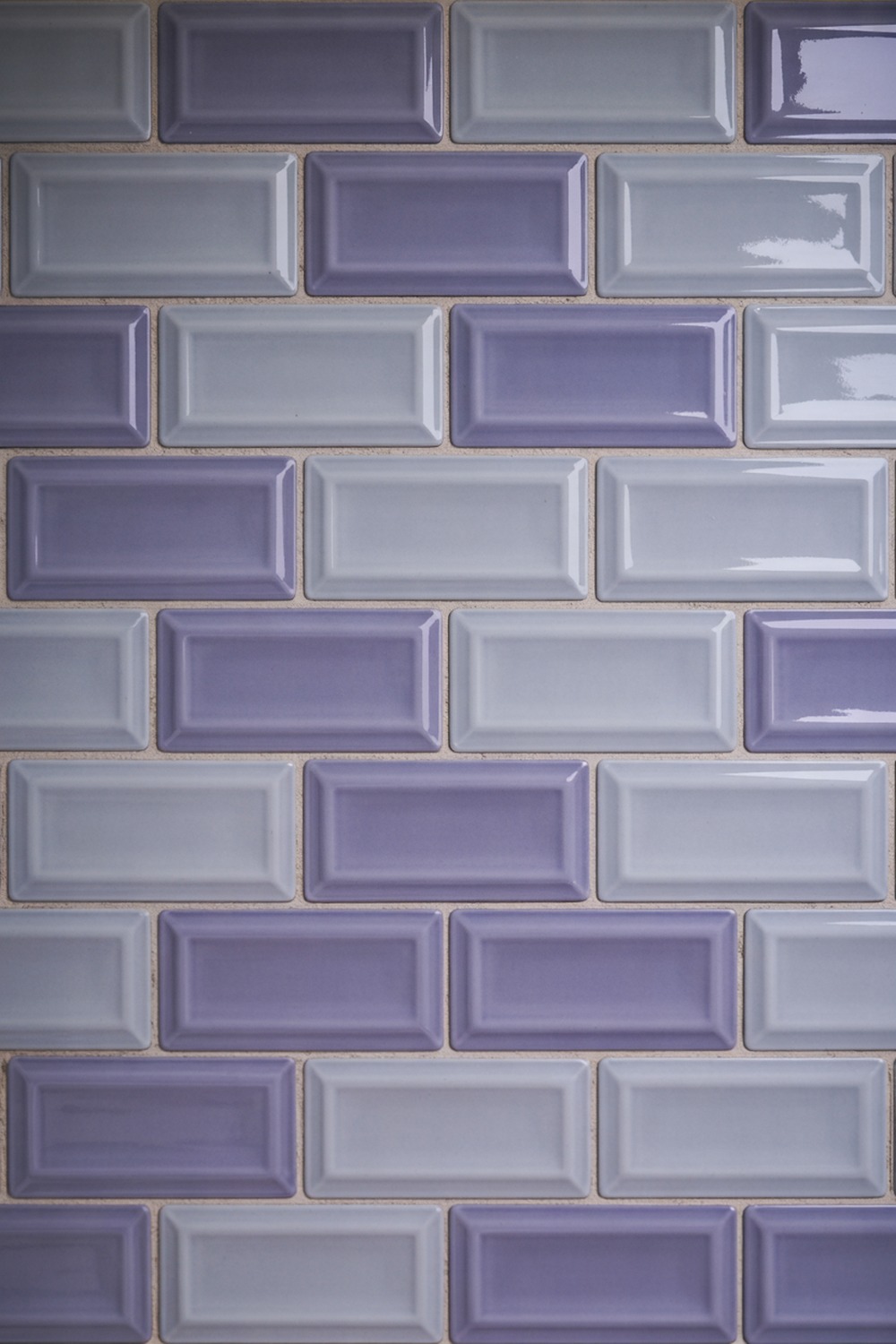
Lavender walks a fine line, and the secret is to keep it greyed, like the inside of a seashell. A glossy 3×6 tile in a soft offset bond gives it a crisp, modern spine. Honestly, lavender and polished nickel together feel like a 1970s Parisian apartment.
18. Forest Green Bathroom Tile
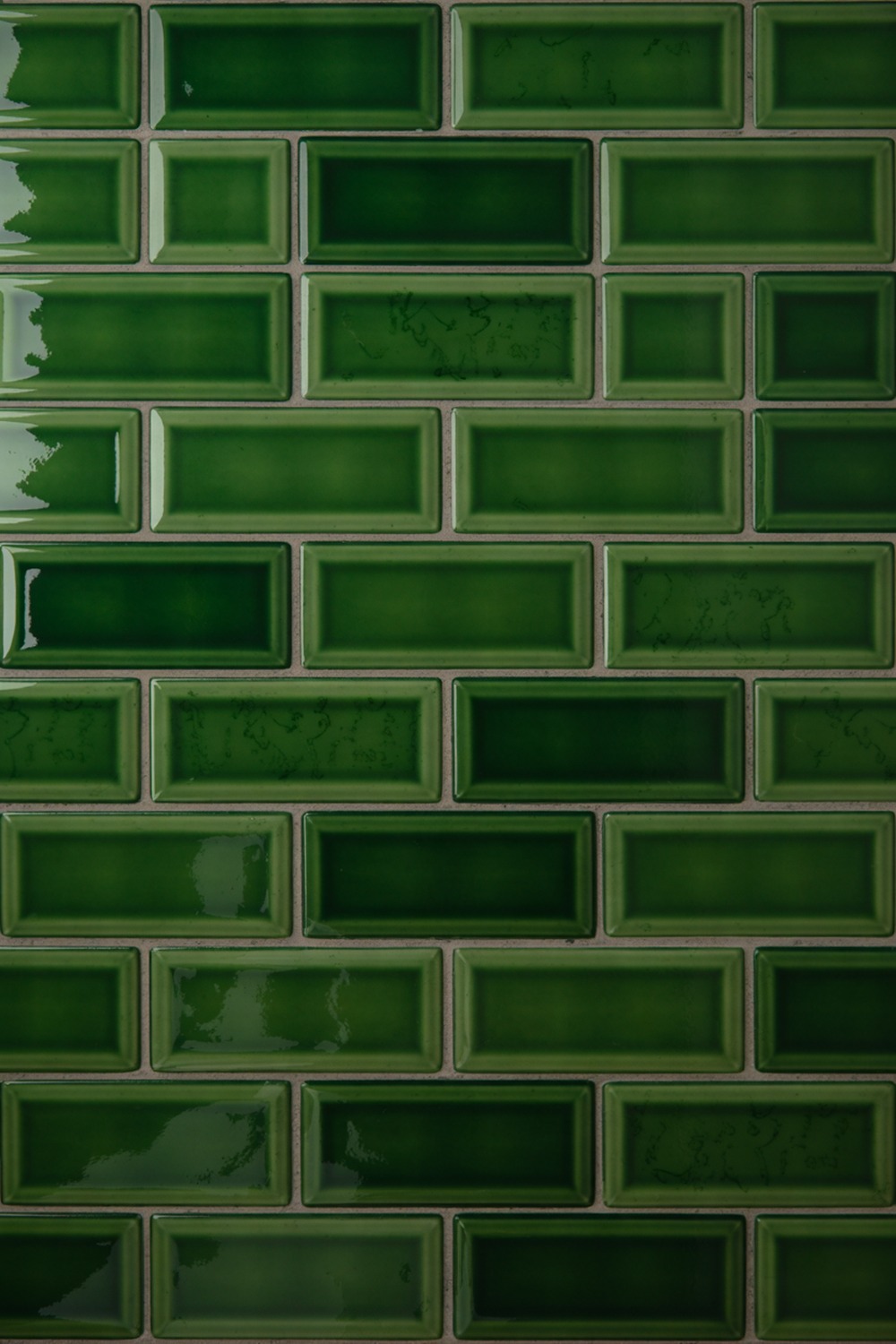
Forest green is the color I would pick if I could only pick one. It is rich, timeless, and reads as expensive the second it goes up. A glossy 2×6 brick-lay in a deep pine catches light along every edge and keeps the dark from feeling flat.
This is where I splurge on unlacquered brass, which ages to a soft gold against the green like nothing else. A paint such as Sherwin-Williams Pewter Green on the ceiling makes the whole room feel dipped.
If you want proof it lasts, look at any 1920s railway hotel; those deep green tiled walls still look right a century on. Pair it with a black-and-white checkerboard floor and you have a scheme nobody regrets.
19. Powder Blue Bathroom Tile
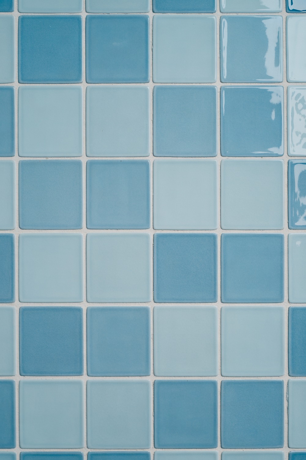
Powder blue is the sweetheart of the bunch, soft and a little nostalgic, like a 1950s powder room done right. A flat 4×4 matte square grid keeps it current instead of retro. The matte finish is key; a gloss powder blue skews baby-shower fast.
White grout is allowed here, one of the few times I say so, because the crisp grid is part of the charm. Warm the whole thing with a rattan mirror and brushed gold taps.
20. Sand Bathroom Tile
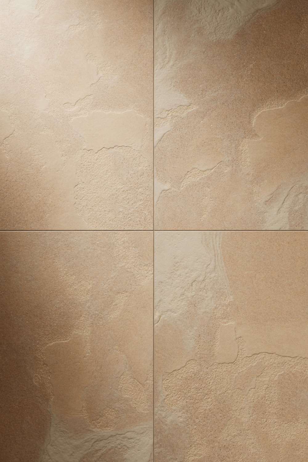
Sand is the warm neutral I reach for when a friend is nervous about color. A matte limestone-look large-format tile keeps the surface seamless, soft rather than stark. Go tonal, sand tile and pale oak and a jute mat underfoot, and let the stone do all the talking.
21. Dusty Pink Bathroom Tile
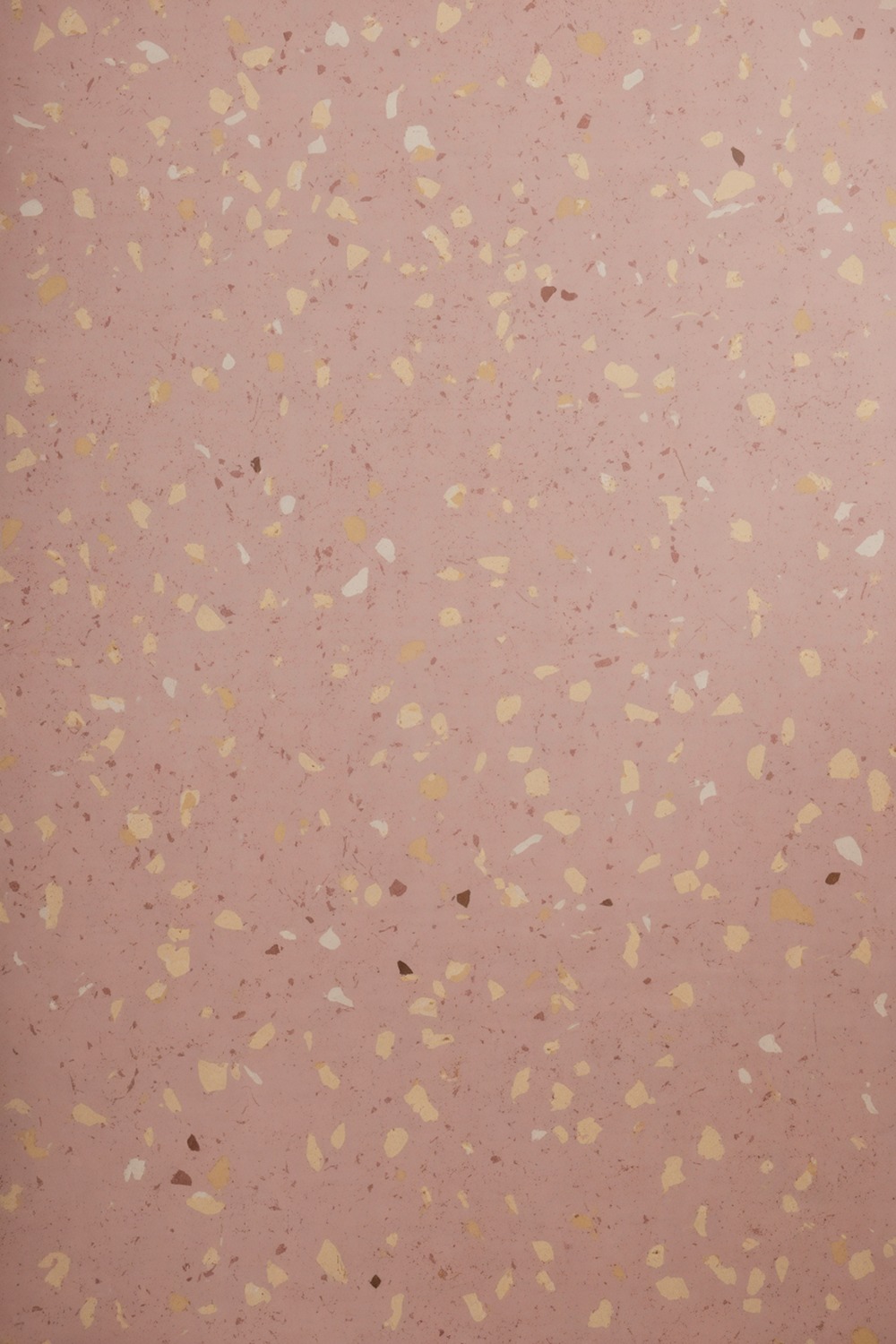
Dusty pink closes the list because it is pink for people who swear they hate pink. Muted and earthy, with a grey undertone, it behaves like a warm neutral all day. A pink-based terrazzo, speckled with cream and clay chips, gives it texture and a little 1980s Milan attitude.
Keep the fittings matte black to sharpen all that softness. One trailing pothos on a floating shelf, and the room is done.
Which Bathroom Tile Color Is Right for You
Start with the light you actually have. A north-facing room with cool light comes alive with warm shades, so lean to peach, sand, ivory, or mustard. A bright room that already floods with sun can carry the cool and the dark, so navy, forest green, or charcoal will feel rich.
Then ask how long you want to live with it. The quiet shades, tan and ivory and powder blue, forgive changing taste and resale nerves.
The bold ones, orange and purple and mustard, are perfect in a small powder room where commitment is cheap and a guest’s gasp is the whole point. My honest advice: be braver in the smallest room in the house.
Single-Color Bathroom Tile, Answered
Is one color on every wall too much? Rarely, if the shade is right. A single color reads as calm and custom; it is busy patterns and clashing two-tones that overwhelm a small bath. Carry the color high and keep the grout close in tone.
What will this cost? Tile itself runs from budget-friendly for a standard ceramic subway to a real splurge for handmade zellige or natural stone. The bigger cost is usually labor, especially for small mosaics and herringbone, which take longer to set.
Can I do it myself? A straight grid of large-format tile on one wall is a doable weekend job for a confident DIYer. Intricate shapes, wet-room floors, and full showers are a job for a pro who can handle waterproofing properly.
How long does a bathroom tile job take? A single feature wall is often a day or two. A full bathroom, demolition to grout, usually runs one to two weeks once you factor in waterproofing and curing time.
What do I ask the tile shop for? Name the shape, size, finish, and color you want, plus a grout matched to the tile rather than bright white. Ask for 10 percent extra for cuts and breakage, and request a matching bullnose or trim piece for exposed edges.
Pick the one shade that makes you a little nervous, order a sample, and tape it to the wall for a week. If it still makes you smile on day seven, that is your bathroom. Go for it.
More stories
Share this story