18 Two-Tone Bathroom Tile Combos That Always Look Right

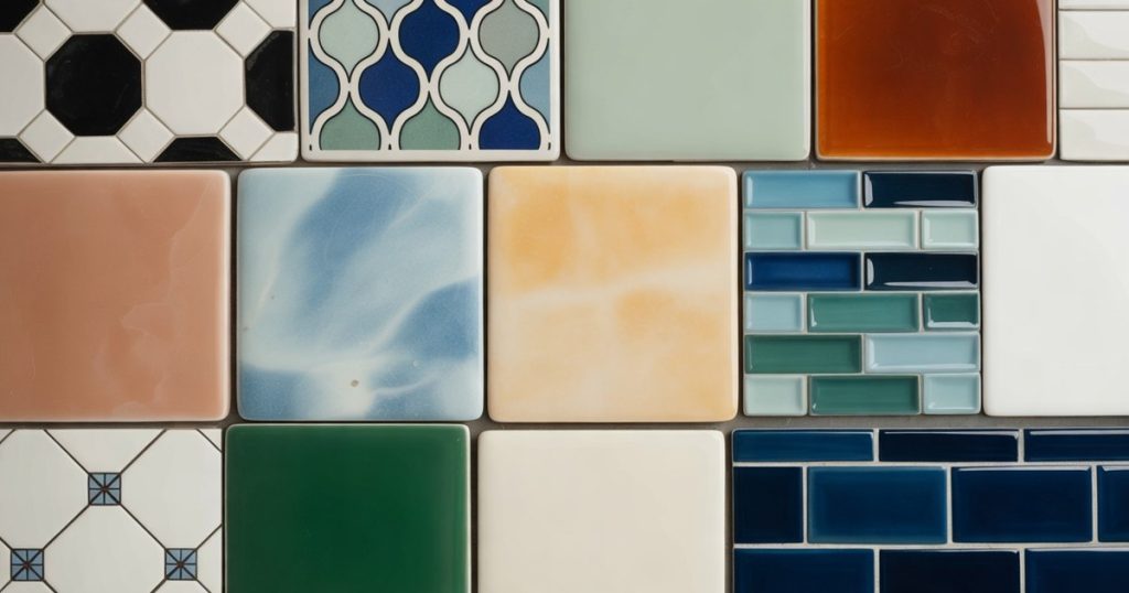
I will admit something: I judge a bathroom by its tile before I notice anything else. The vanity, the mirror, the expensive tap, all of it comes second. Tile is the one thing you cannot swap on a whim.
Here is the thing about two-tone tile. One colour alone can feel flat or a little safe. Two colours, chosen well, give a small room depth, rhythm, and a point of view. That is quiet confidence, and it is the whole game.
Below are eighteen two-colour tile pairings I keep coming back to, from the hardest-working classics to a few braver combinations. For each one I will give you the look, a paint shade to match, the tile to ask your shop for, and where to start.
1. Black and White Bathroom Tile
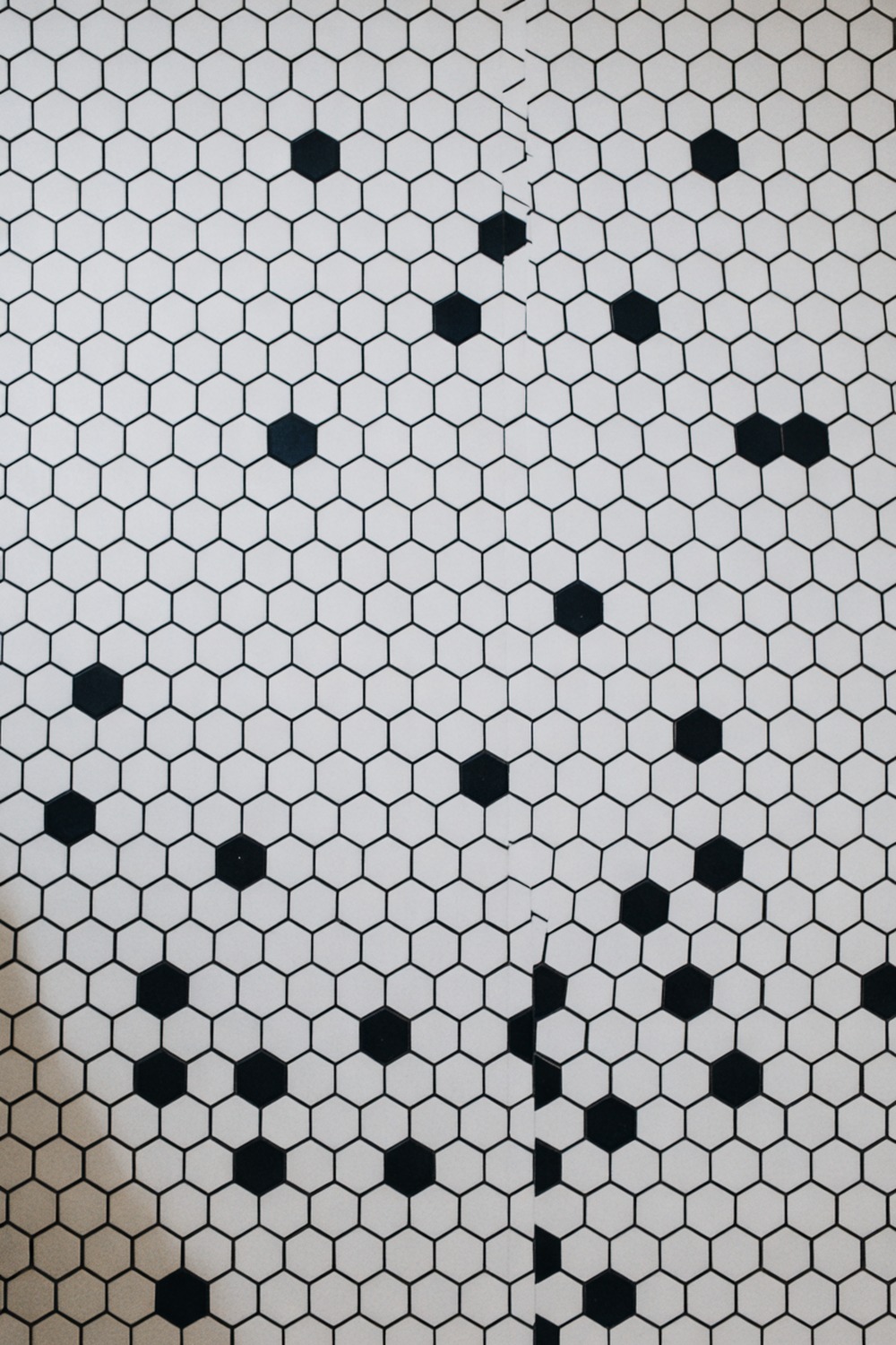
Nothing beats black and white. It has outlived every trend since the 1920s, and it will outlive the next one too. The reason is simple. It is graphic, it is clean, and it photographs like a dream.
My pick is a 2-inch matte hexagon in white with a scatter of black blooms laid across the floor. The honest black-bordered white field on the walls works just as hard. Pull the walls up in a soft chalk white like Dulux White Cotton so the tile does the talking.
The trick is restraint. Let black be the accent, not the equal partner, or the room reads like a chessboard.
Start with the floor and keep everything above it calm. This is the pairing I send nervous clients to first, because it is almost impossible to get wrong.
2. Blue and White Bathroom Tile
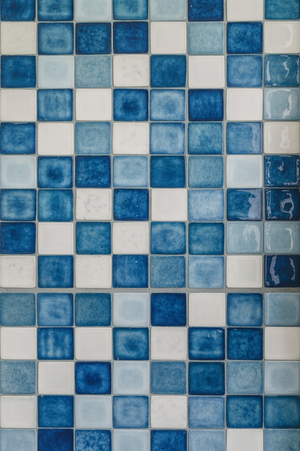
If black and white is the little black dress, blue and white is the striped shirt. Just as timeless, a touch more relaxed, and impossible to get wrong.
I love this one in hand-glazed zellige, the Moroccan clay tile with that watery, uneven shine. Match the blue to Benjamin Moore Van Deusen Blue, run it in the shower, and keep the rest white.
3. Grey and White Bathroom Tile
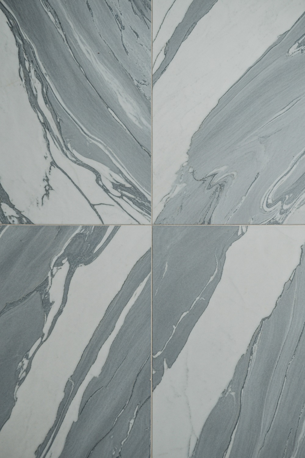
Grey got a rough reputation for a few years, blamed for every builder-grade bathroom in the country. Done with a little warmth, it is still one of the most liveable pairings there is.
The move is warm grey, never cold. Large-format grey marble-look porcelain, 12 by 24 inches, with white walls above a half-height line, and a greige like Sherwin-Williams Agreeable Gray up top to hold the warmth.
Begin with the floor tile and let its veining set your grey. Everything else follows that one slab.
4. White With Black Grout Bathroom Tile
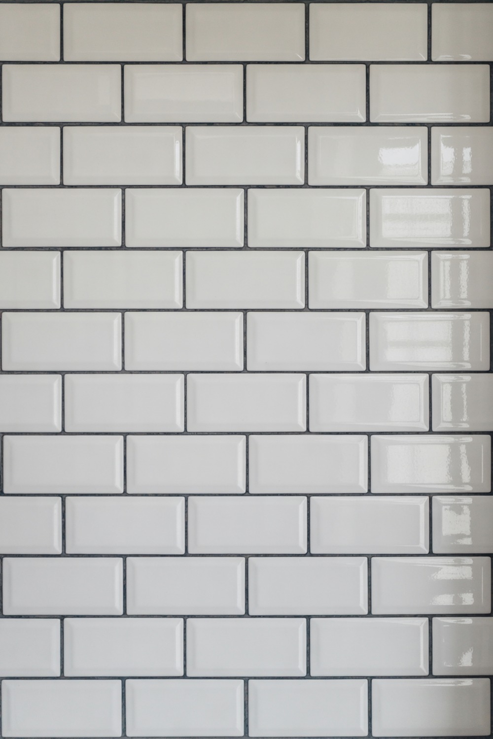
Here is a cheap move that looks expensive: plain white tile, but with black grout. The grout turns a budget tile into a graphic grid, and nobody will guess what you paid.
Classic 3 by 6 inch white subway, stacked vertically for a modern feel or in a herringbone if you want drama, with charcoal grout tracing every edge. Honestly, the grout is doing more work here than the tile.
Keep the woodwork bright with a clean trim white like Behr Ultra Pure White.
Buy the most honest ceramic subway you can find, then put the saving toward good grout and a careful tiler. That is where the finish lives.
5. Sage and Cream Bathroom Tile
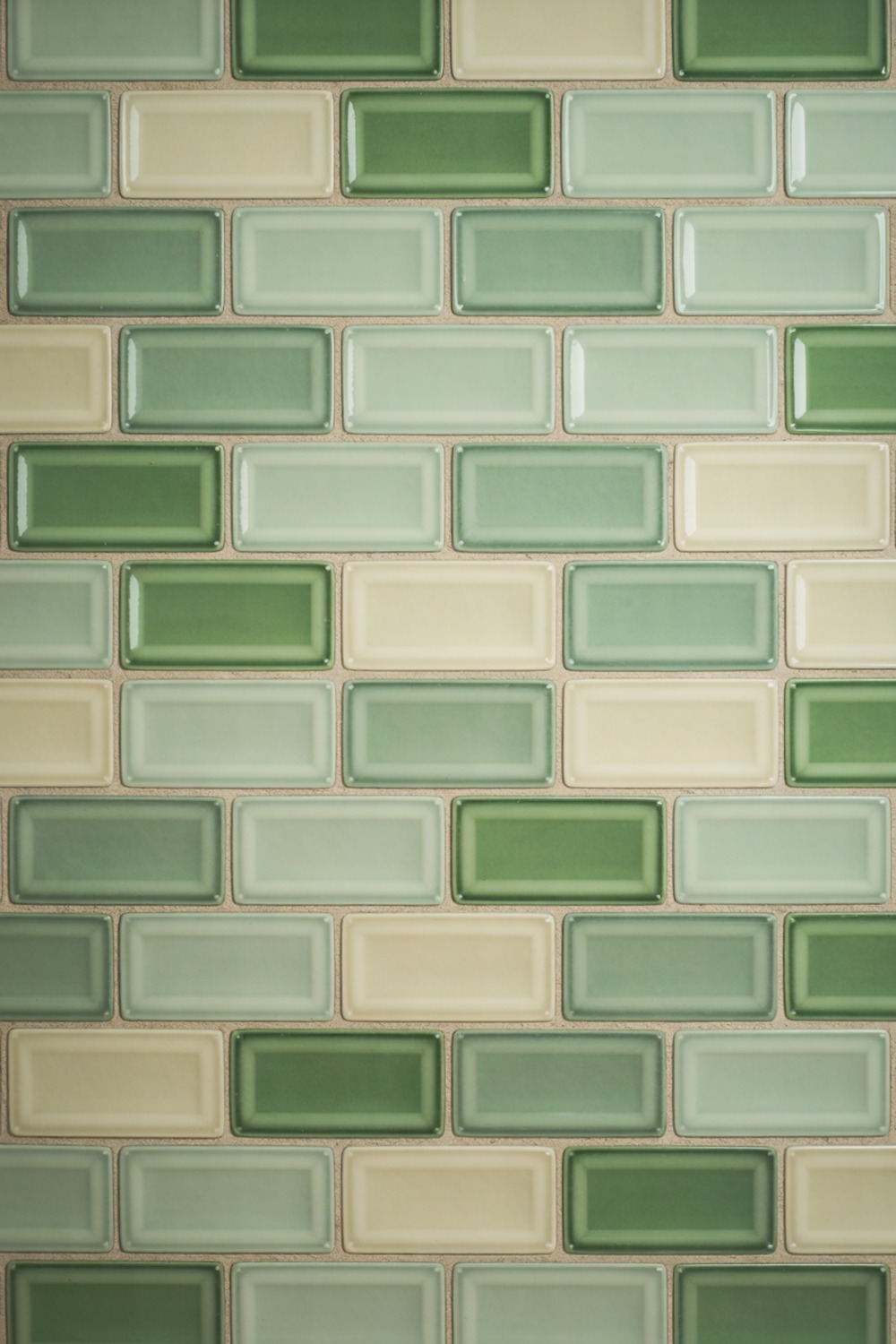
Sage and cream is the bathroom equivalent of a slow exhale. You know the drop in your shoulders when you walk into a calm room? This pairing is built to do exactly that.
A soft sage on the walls in 2 by 8 inch glossy ceramic, with a creamy limestone-look floor underneath. Limewash a nook if you want that chalky, old-plaster depth. The sage I reach for is Farrow and Ball Card Room Green; the cream, Little Greene Slaked Lime.
Lead with the tile colour, then pull the cream up from the floor into the grout and the trim so the two never fight.
6. Green and White Bathroom Tile
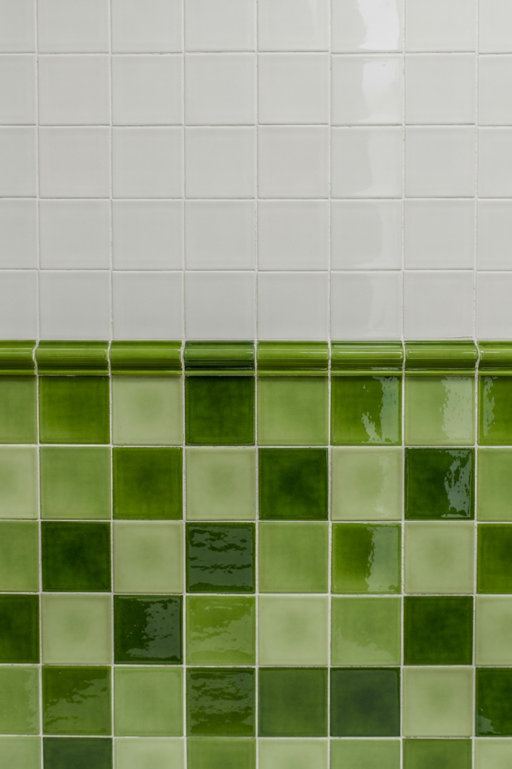
Want one pairing that feels fresh in the morning and calm at night? Green and white is my answer, and it suits a north-facing room that needs waking up.
Go grassier than sage, in a glossy 4 by 4 inch square, with bright white grout and a green like Little Greene Mid Azure Green on the lower third. White up top. That two-thirds line never looks wrong.
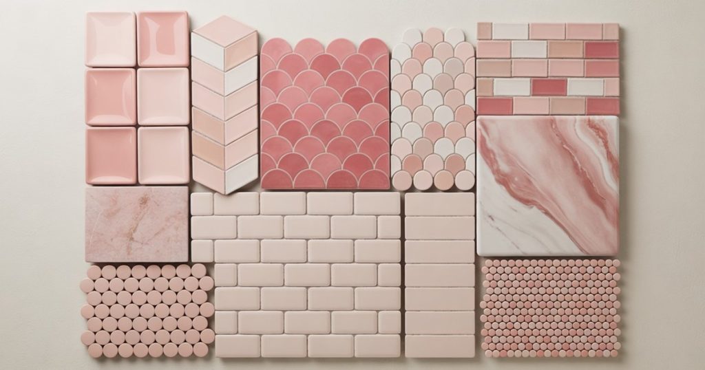
7. Pink and Black Bathroom Tile
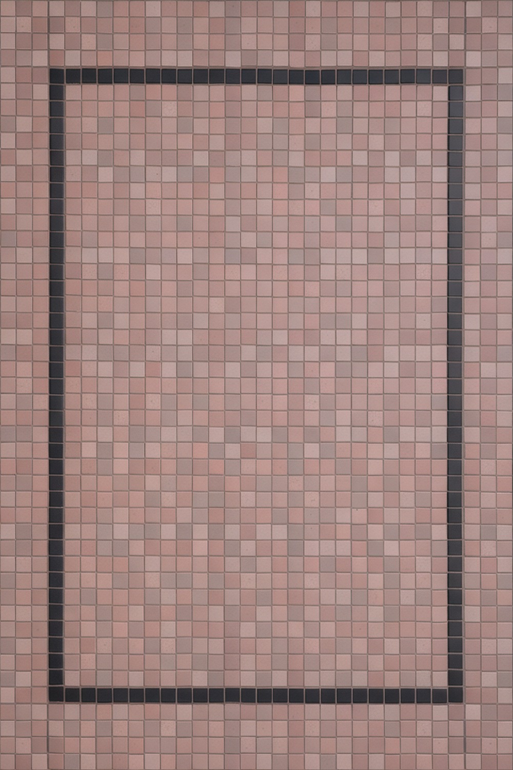
Pink and black sounds like an eighties flashback, and in careless hands it is. In careful hands it is pure Parisian nerve. It is the Wes Anderson of bathrooms, really.
Go dusty and muted, never bubblegum, in a matte finish, with slim black liner tiles and black fittings. A 2 by 2 inch pink mosaic floor with a black pencil-liner border is my favourite version. The pink wants to be Farrow and Ball Setting Plaster, soft and a little brown.
Pick the pink first, the muddiest one you dare, then add black in thin doses only.
8. Beige and Brown Bathroom Tile
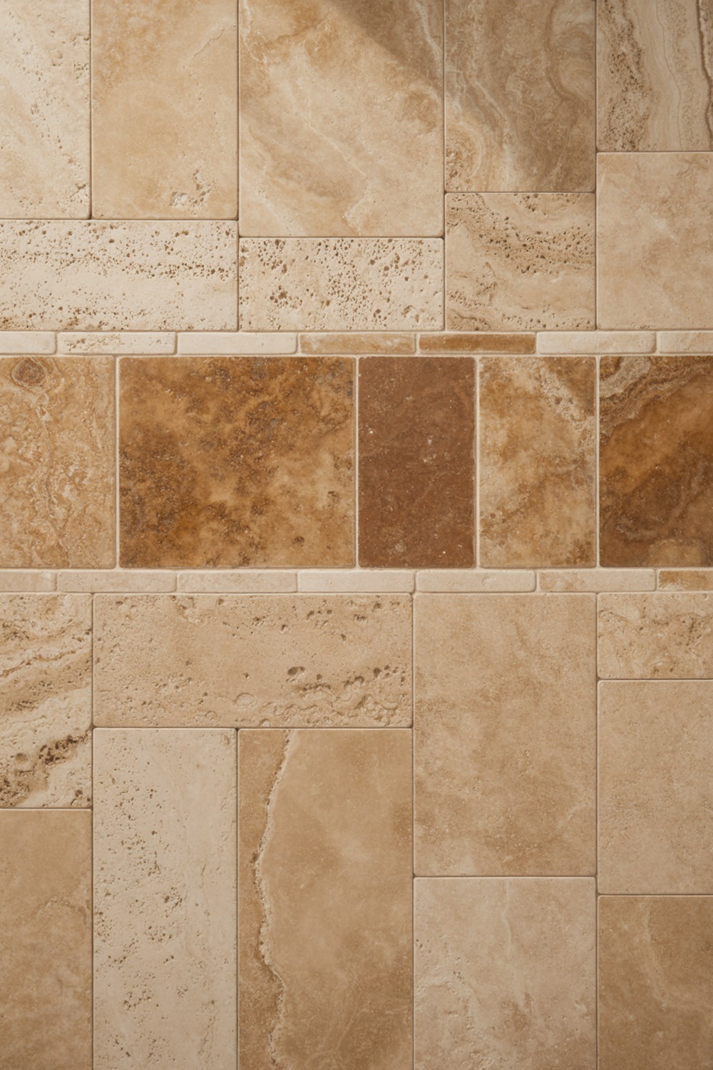
I used to think beige and brown was the most boring pairing on earth. Then I saw it done in travertine and changed my mind on the spot.
Warm beige travertine on the floor, a deeper walnut vanity, a tobacco shower. Walls in a mushroom beige like Benjamin Moore Shaker Beige. Stay tonal, three shades of one warm family, and let the stone do the work.
9. Terracotta and Cream Bathroom Tile
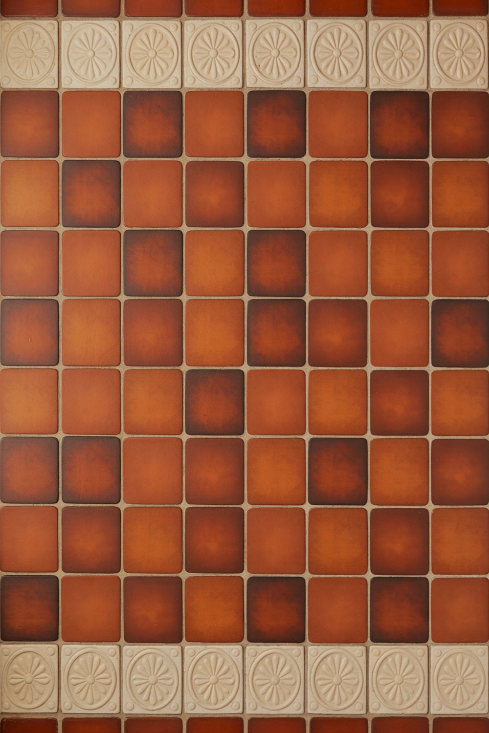
Picture a sun-warmed farmhouse in Provence, shutters half-closed against the heat. That is the feeling terracotta and cream is after.
Terracotta is the obvious hero: square 6 by 6 inch clay tiles in that burnt, earthy red, grouted in a creamy off-white that cools the whole thing down. A cream encaustic border lifts it from rustic to considered.
Cream walls in Dulux Natural Hessian hold the warmth. Begin with the terracotta floor, because its colour sets the temperature of the room.
10. Teal and Gold Bathroom Tile
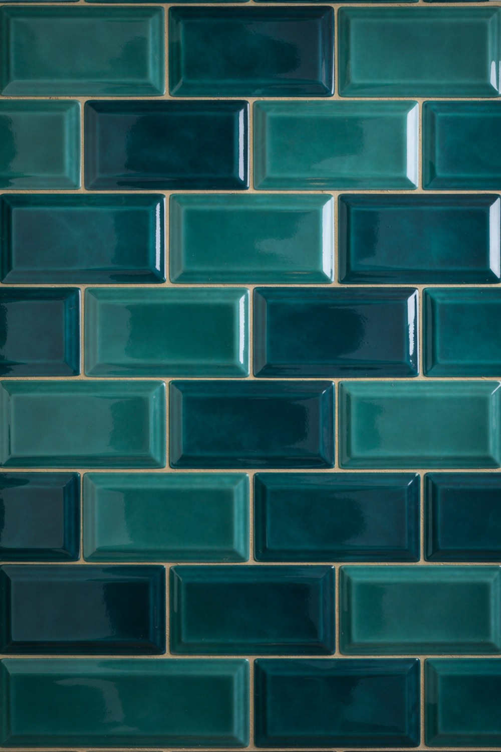
Teal and gold is the pairing I recommend when someone wants glamour without a gold-plated everything. It flatters a windowless powder room better than almost anything.
Deep teal gloss tile, 3 by 12 inch, stacked vertically to lift a low ceiling, with brushed-gold taps and a gold-framed mirror. Keep the gold to the metals, never the tile. Gold fittings against teal read Art Deco; gold tile just reads flashy.
A teal like Sherwin-Williams Oceanside is the one. Tile a single bold wall and let the metals carry the sparkle.
11. Charcoal and White Bathroom Tile
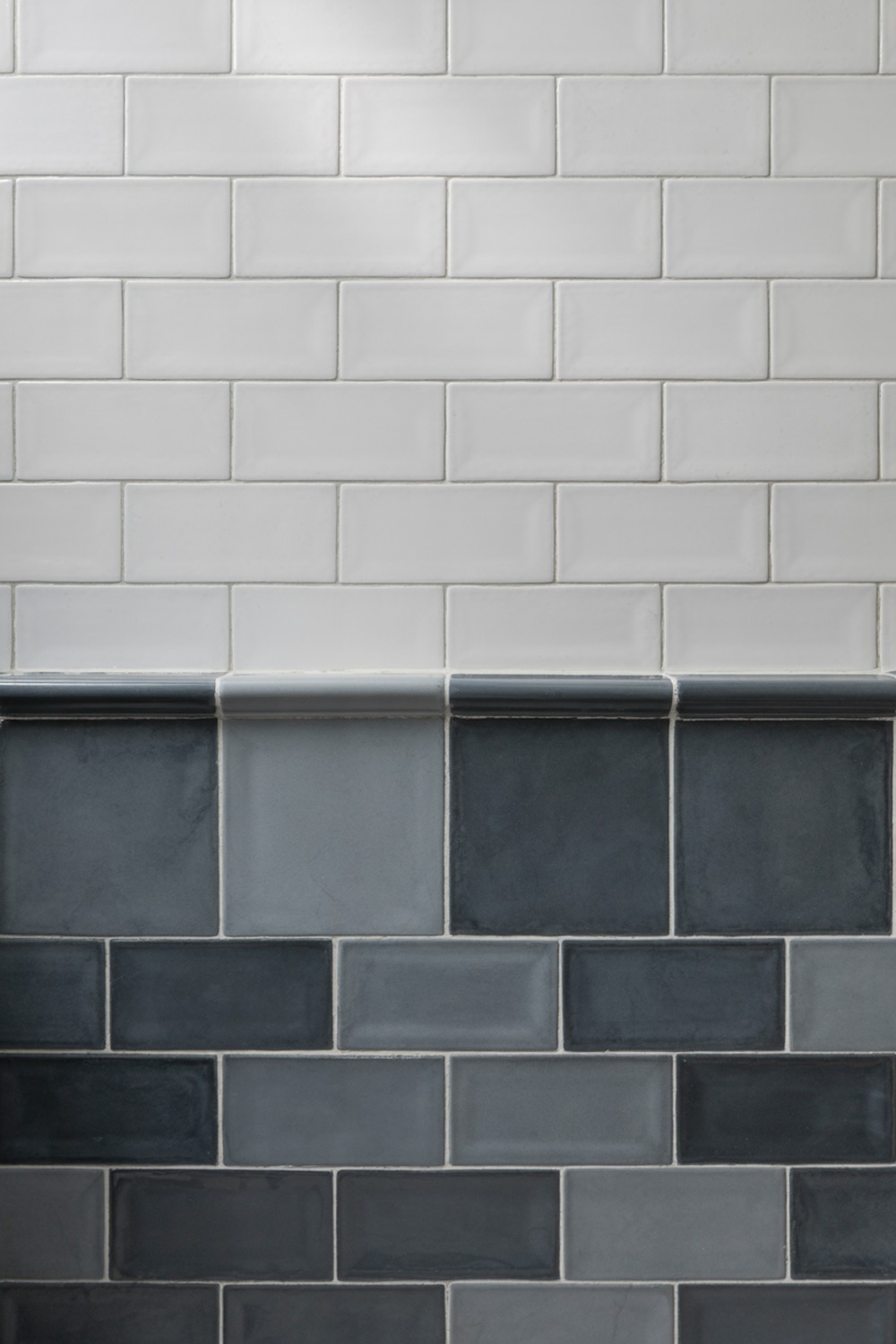
If black and white feels too stark, charcoal and white is its softer cousin. Charcoal is black with the volume turned down, and far more forgiving in a small space.
Large charcoal porcelain on the floor, white 3 by 9 inch tile on the walls, mid-grey grout to bridge the two. Paint a feature wall in Benjamin Moore Kendall Charcoal, go dark underfoot and light overhead, and the room feels grounded yet open.
12. Blush and Grey Bathroom Tile
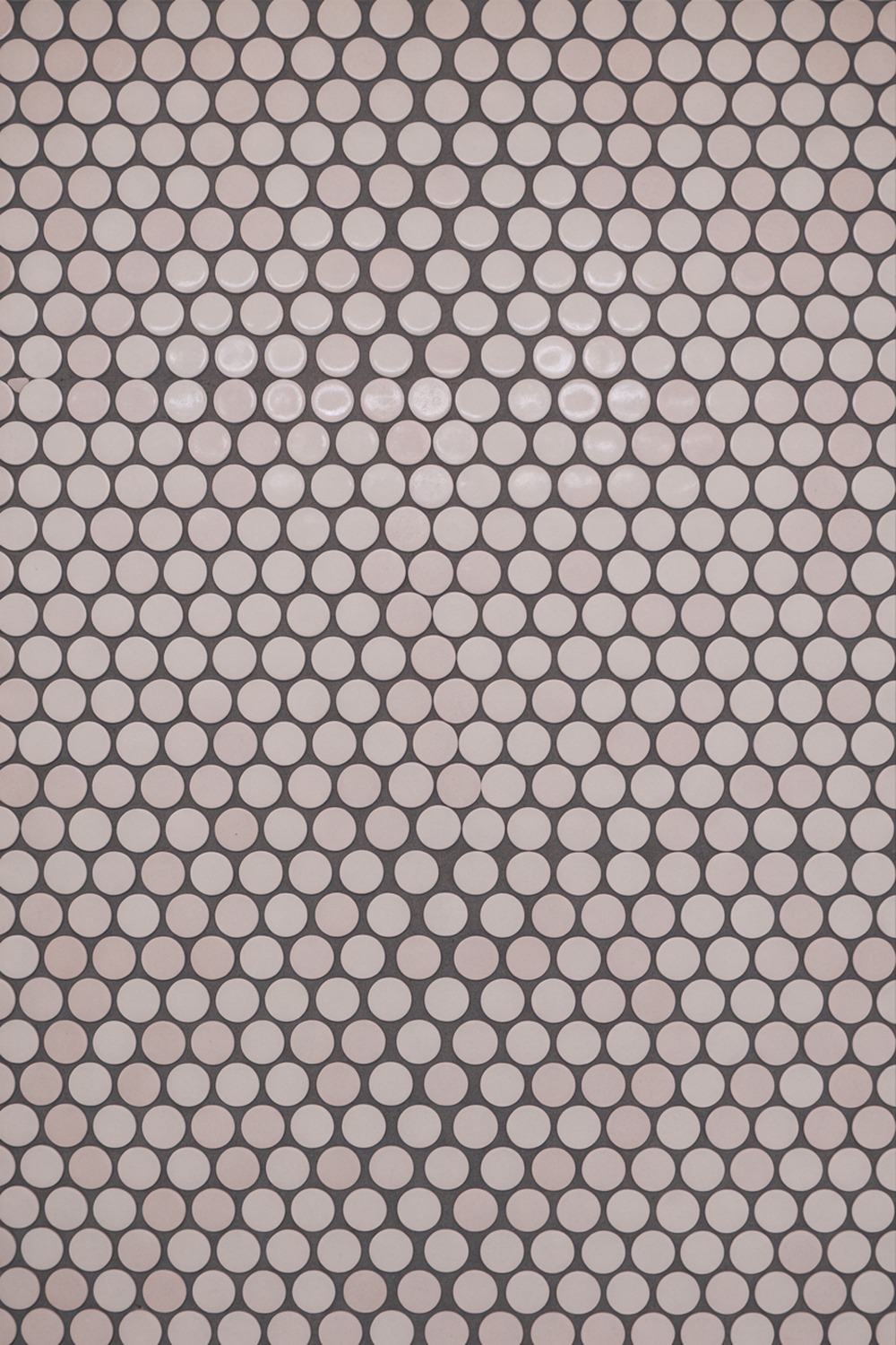
The trick with blush is to anchor it, or it floats off into nursery territory. Grey is the anchor.
Pale blush pink in a 2.5 inch penny round on the floor, grounded by cool microcement-look grey walls and matte-black taps. I would choose a blush with a grey undertone, not a peachy one. A grey like Little Greene Urbane Grey keeps it grown-up next to the concrete.
Lay the penny-round floor first, then pick the greyest grey the blush can tolerate. The tension between soft and hard is the point.
13. Mint and White Bathroom Tile
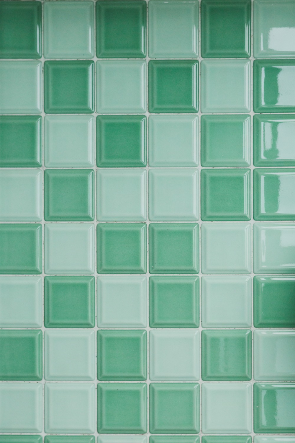
Mint green has a retro reputation, all 1950s powder rooms and chrome, and I say lean right into it. There is a reason it keeps coming back.
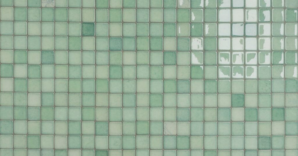
Glossy mint in 4 by 4 inch squares, bright white grout, a white pedestal basin, chrome taps. A mint like Behr Bay Water on the ceiling adds a wink overhead. Half-tile the walls to chair height and let a curvy retro basin seal it.
14. Emerald and Gold Bathroom Tile
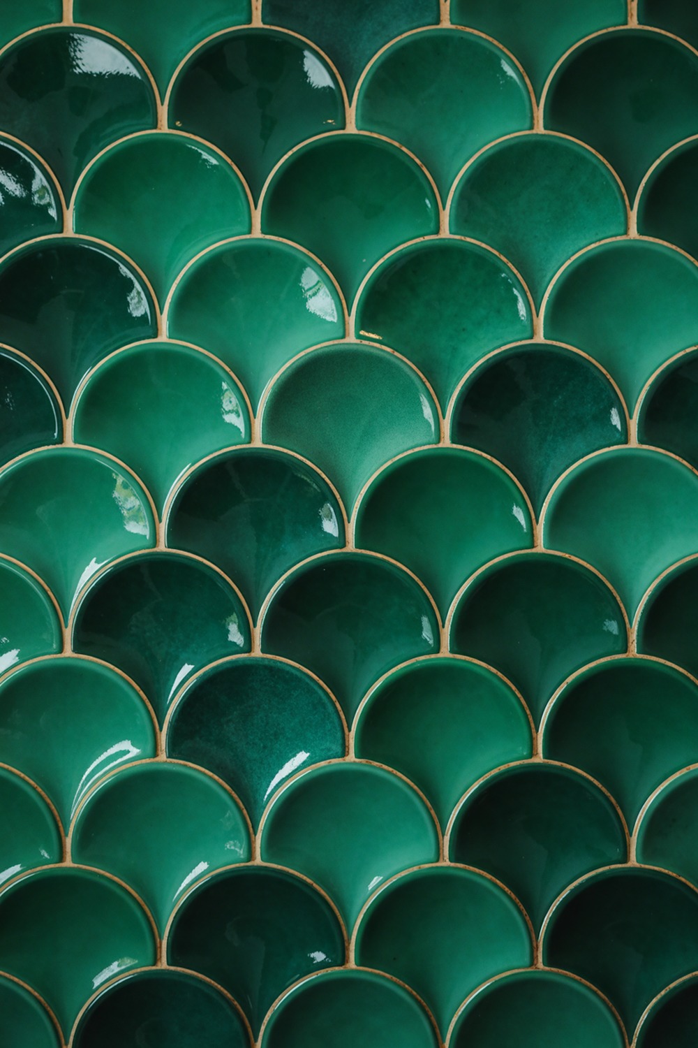
This is the one for a powder room you want guests to gasp at. It is unapologetic, and it should be.
Rich emerald, deep and jewel-like, in a glossy 3 by 6 inch brick or a fan-shaped scallop. Add unlacquered brass taps and a gold mirror. Emerald wants a dark, moody room, not a bright one.
Paint the ceiling the same green, think Farrow and Ball Duck Green, and let it wrap around you like a jewel box.
Start with the emerald in the shower or on a full feature wall, then add brass, never chrome. The brass is what tips it from bold into properly luxurious.
15. Black and Gold Bathroom Tile

Black and gold is black and white’s dressed-up sibling, ready for a night out. Handled with discipline, it is the most quietly luxurious pairing on this list.
Matte black tile, large-format or a 2 inch hex, with brushed-gold fittings and a gold-framed mirror set against all that darkness. I would keep every surface matte black and let one run of gold be the jewellery.
One metal, used sparingly, is the difference between chic and casino.
If you paint, reach for a true black like Farrow and Ball Pitch Black. Then add gold only at the taps, the frame, and the towel rail, and nowhere else.
16. Blue and Green Bathroom Tile
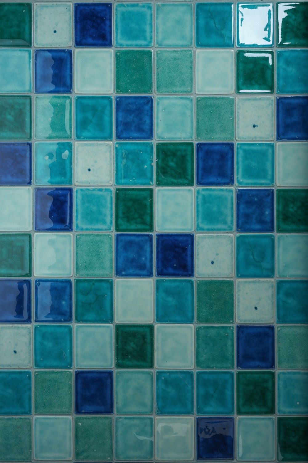
They told you blue and green should never be seen. They were wrong, and I will happily argue it.
A teal-leaning blue beside a deep sea green, both in glossy 4 by 4 inch zellige, makes a shifting, underwater shimmer that moves with the light. Pull the two from one family, something like Little Greene Canton for the blue and Sage and Onions for the green.
Mix the boxes and lay them scattered across one wall, because the hand-made unevenness is the whole charm.
17. Navy and Cream Bathroom Tile
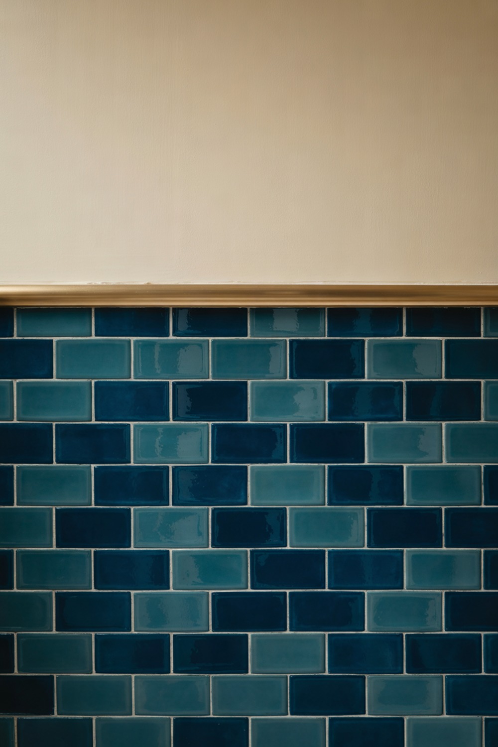
Navy is the colour I recommend to anyone nervous about going dark. It is the gentle way in.
Navy 3 by 6 inch gloss subway below the dado line, warm cream plaster above, a thin brass rail along the join. Navy like Benjamin Moore Hale Navy, cream like Farrow and Ball String. The cream is exactly what stops navy from feeling like a cave.
18. Olive and Ivory Bathroom Tile
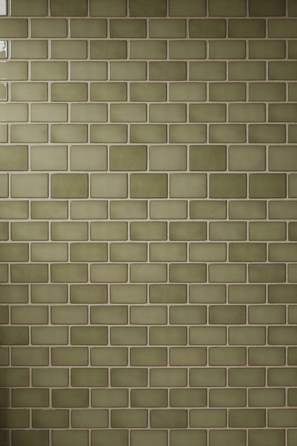
We finish with my dark-horse favourite: olive and ivory. Olive is green with a grey-brown soul, earthy and calm, the Goldilocks of greens. Not too bright, not too grey.
Pair a matte olive tile, a 2 by 6 inch handmade-look brick, with soft ivory walls and aged-brass taps. Olive like Dulux Overtly Olive, ivory like Little Greene White Lead.
Begin with the olive tile, because its muddy warmth decides the ivory, and not the other way round.
Which Two-Tone Tile Pairing Is Right for You
Start with how you want the room to feel, not with a colour swatch. If you want calm, go tonal: sage and cream, beige and brown, olive and ivory. These soften a room and ask nothing of you at seven in the morning.
If you want energy and a clear graphic punch, go high-contrast: black and white, charcoal and white, or white with black grout. They suit a small room, because the strong lines read as intentional rather than busy.
If you want drama and a little glamour, the jewel pairings are yours: emerald and gold, teal and gold, navy and cream, pink and black. I would save these for a powder room or a guest bath, where a bold choice is a gift to your visitors.
And if you simply want fresh and happy, mint and white or green and white will do it every time. Match the mood to the room you have, and the colour choice gets a great deal easier.
Two-Tone Bathroom Tile, Answered
How much does a two-tone tile bathroom cost? It sits on a wide band. A budget version, ceramic subway with a smart grout colour, is affordable, and the tile is the cheap part. Hand-glazed zellige, real travertine, or a lot of mosaic pushes it to the splurge end.
Can I tile over my existing tile myself? A small feature wall or a simple stacked subway is a realistic weekend job if you are handy. A full floor or a wet shower area is a job for a pro. Water in the wrong place is an expensive lesson.
How long does a bathroom retile take? For a standard family bathroom, think roughly one to two weeks with a tiler, longer if the layout changes or plumbing moves. Intricate patterns like herringbone or scattered zellige add days, because the setting-out is slow and careful.
What is the one thing worth spending on? The tiling labour, every time. A middling tile laid beautifully looks better than a gorgeous tile laid badly, and crooked grout lines haunt you forever. Pay for the hands, save on the tile if you must.
What do I tell the tiler? Give them the tile size, the layout you want, the grout colour by name, and a photo of the finished look. Ask for the grout you chose, not the standard grey, and confirm the setting-out before they stick anything down.
So pick your two colours, choose the one you lead with, and start there. One brave pairing, laid with care, is all it takes to turn a plain bathroom into the room you look forward to. Go on, be a little bold.
More stories
Share this story